LLM_log #025: Fame and Uniqueness — Measuring What Makes a Cover Memorable
Fame and Uniqueness: Measuring What Makes a Cover Memorable
Highlights: Romaniuk’s Distinctive Brand Asset framework (2018) splits brand memorability into two axes — Fame (exposure history) and Uniqueness (visual distinctiveness) — but only one of them is recoverable from a picture. We build a full measurement pipeline on top of Gemini 2.5 Pro: genuine pairwise visual-distinctiveness judgments aggregated with the Bradley–Terry model (not a single holistic LLM call), a 13-family literature-grounded absolute-scoring taxonomy, and real public Fame data researched wherever it exists rather than guessed. Applied to 21 thriller/mystery book covers and, as an independent cross-check, 21 movie posters (20 real + 1 invented item in each set), with every quoted comparison and every number traceable to a saved JSON file — including a real rank flip we found in the data that shows concretely why the Bradley–Terry fit needs several iterations to converge, not one.
Tutorial Overview:
- Two numbers, one theory
- Fame — the one you can’t get from a photo
- Uniqueness — the one you actually can compute
- Twelve more scores per cover — and how they relate to the one above
- The map, twice: books and movie posters
- What this does and doesn’t prove
1. Two numbers, one theory
Jenni Romaniuk’s Distinctive Brand Asset framework (Romaniuk, 2018) says a piece of visual branding earns its keep on exactly two axes:
- Fame — what % of category buyers would name your brand from this asset, de-branded, unprompted.
- Uniqueness — of those who named any brand, what % named only yours.
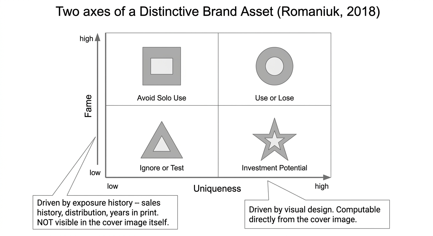
Fig 1. Two axes of a Distinctive Brand Asset (Romaniuk, 2018).
The published benchmarks: average distinctive asset sits at Fame 26% / Uniqueness 54%; shape-based assets (logos, packaging silhouettes) do best at 40% / 71%; colour-only assets do worst at 12% / 39%.
This post asks a narrower, concrete question: for a real category, can we actually measure these two things — not guess at them — using vision-language models, and place a genuinely new item on the resulting map the same way we’d place a real one?
Category chosen: thriller/mystery book covers. 20 real titles, one invented 21st cover (“THE QUIET WARD”), Gemini 2.5 Pro doing the visual judging throughout. A second, independent replication of the same pipeline — 20 real movie posters plus one invented poster (“THE LAST TIDE”) — appears in Section 5, as a check on whether the method holds up in a domain with a completely different Fame situation.
2. Fame — the one you can’t get from a photo
Fame is a property of exposure history: marketing spend, distribution breadth, years in print. It is not a property of the cover’s design.
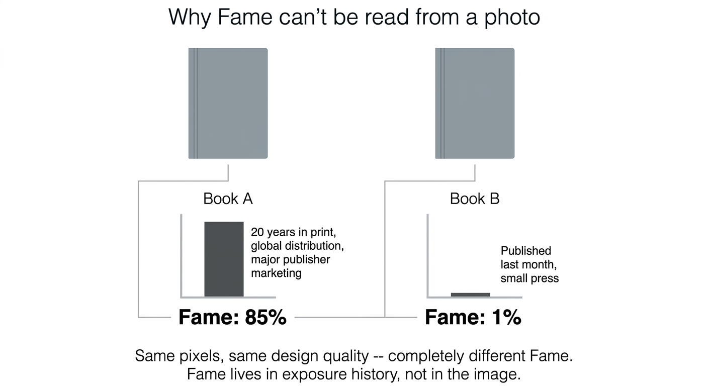
Fig 2. Same pixels, same design quality, completely different Fame — Fame lives in exposure history, not in the image.
We tested this claim against reality rather than just asserting it. For all 20 real books, we researched actual public sales figures — not estimates, actual publisher- or press-reported numbers.
| Title | Real sales figure | Source note |
|---|---|---|
| And Then There Were None | 100M+ copies | “World’s best-selling mystery novel,” widely reported |
| The Da Vinci Code | 80M+ copies | Widely reported since 2003 |
| The Girl with the Dragon Tattoo | 30M+ (first book) | Trilogy total 80M+ |
| Where the Crawdads Sing | 18M+ copies | Publishers Weekly, April 2023 |
| Gone Girl | 20M+ copies | Multiple press sources, by 2019 |
| The Girl on the Train | 23M+ copies | Multiple press sources |
| The Silence of the Lambs | 10M+ copies | Harris’s best-selling novel |
| Verity | 3M+ copies | Amazon/press, 2022 |
| The Silent Patient | 6.5M+ copies | Celadon Books |
| The Maid | 2M+ copies | Publisher, Sept. 2023 |
| Rebecca | 2.8M copies | Mental Floss — a dated 1938–1965 figure |
| The Thursday Murder Club | 1M+ copies (UK) | Mushens Entertainment |
12 of 20 titles (60%) have a real, publicly reported sales figure. That is a strikingly different situation from a packaged-goods category: publishers actively publicize milestone sales numbers as marketing collateral, so real data is the norm here, not the exception. The other 8 titles (Big Little Lies, Sharp Objects, The Talented Mr. Ripley, In the Woods, Mystic River, The Kind Worth Killing, The Guest List, The Lincoln Lawyer) have no title-specific public figure we could find — for some, only an aggregate across the author’s whole body of work exists, which isn’t the same thing.
So: where real data exists, we use it. Everywhere else, Fame comes from Gemini’s own knowledge estimate — prompted to state, from its training knowledge, roughly what % of thriller/mystery readers would recognize each cover. This is explicitly a proxy for a real survey, not a survey. Every judgment call in this post uses Gemini 2.5 Pro. A newer reasoning model, gemini-3.1-pro-preview, has since shipped; none of this post’s scoring was re-run on it, which is worth knowing if you try to reproduce these exact numbers with today’s default model.
3. Uniqueness — the one you actually can compute
Unlike Fame, Uniqueness is a property of the image itself relative to a competitive set — and “relative to” is the operative phrase. You cannot ask “how unique is this cover?” of a single image in isolation; the question only means something when you show the model two covers and ask which one a reader could pick out more easily.
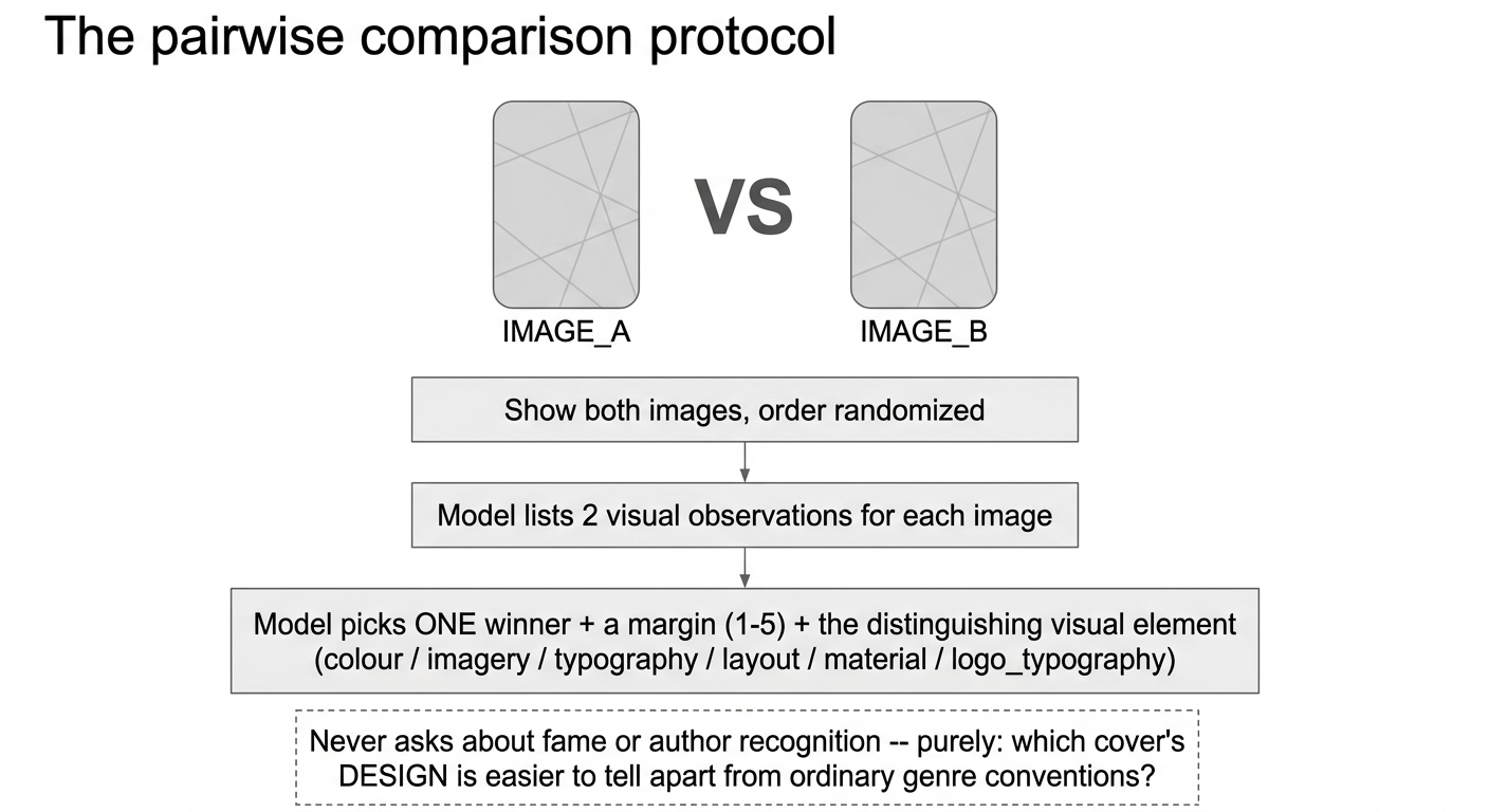
Fig 3. The pairwise comparison protocol used for every Uniqueness judgment in this post.
Here is the exact prompt, verbatim, sent to Gemini for every single comparison in this post:
CONSTRUCT: Visual distinctiveness (Romaniuk's Uniqueness, 2018) -- how
exclusively a cover's DESIGN points to one specific book within its
competitive set (the thriller/mystery genre shelf). This is a pure
visual-design judgment, not author fame or book sales -- ignore how
famous either book or author is.

You are shown two book covers, IMAGE_A and IMAGE_B, in that order.
Imagine each cover shown ALONE on a bookstore shelf, with the title and
author name removed. Judge which cover's remaining visual design
(imagery, colour, typography, layout) would be easier to pick out and
distinguish from ordinary thriller/mystery cover conventions.

First list 2 visual observations about IMAGE_A and 2 about IMAGE_B.
Then decide the WINNER: "A" or "B" (the one that is MORE visually
distinctive). Then rate the MARGIN of that win:
  narrow(1) / slight(2) / moderate(3) / large(4) / decisive(5)
Name the SINGLE distinguishing visual element driving the winner's
advantage: colour, imagery, typography, layout, material, or logo_typography.
Note what it does not ask: it never asks which cover is more famous, which author is better known, or which book you’d rather read. It asks exclusively about the design, with instructions to ignore fame entirely. Three real examples of what comes back, pulled directly from the saved comparison log:
The Silent Patient vs. The Talented Mr. Ripley — A: “A woman’s face is shown on a textured surface resembling canvas, which is stapled or stitched along the vertical edges… a ragged tear runs horizontally across the mouth area.” B: “A black-and-white photograph depicts a man in a suit and fedora, his figure mostly obscured by deep shadows… a classic film-noir atmosphere.” → Winner: The Silent Patient, large, via imagery.
In the Woods vs. The Maid — A: “A sepia-toned photograph of bare tree branches against a light, hazy background… split into four quadrants by thin white lines.” B: “A solid, bright red background framed by a white decorative border… a stylized black keyhole, through which an illustrated figure in a uniform is visible.” → Winner: The Maid, large, via imagery.
The Talented Mr. Ripley vs. The Lincoln Lawyer — A: “A monochromatic, high-contrast black-and-white photograph… a single male figure in a fedora and suit, lit from above.” B: “A full-colour, long-exposure photograph of a city street at night with light trails… a distressed, stenciled red font.” → Winner: The Talented Mr. Ripley, moderate, via colour.
How many pairs, and how we got that number
With 20 real covers plus the invented one, there are 21 images. The complete round-robin — every image compared against every other exactly once — is a combinatorics question: choose 2 out of 21, order doesn’t matter, so
C(21, 2) = 21 × 20 / 2 = 210 pairs.
Running all 210 (each ideally sampled 5 times, in both orders, per the source methodology) was not done here — that’s several hundred to a couple thousand API calls for one construct. What we actually ran was a sparser, still-connected graph: each of the 21 images linked to 5 others in a randomized ring, giving ~105 unique pairs — exactly half the full round-robin, by construction of that particular graph shape.
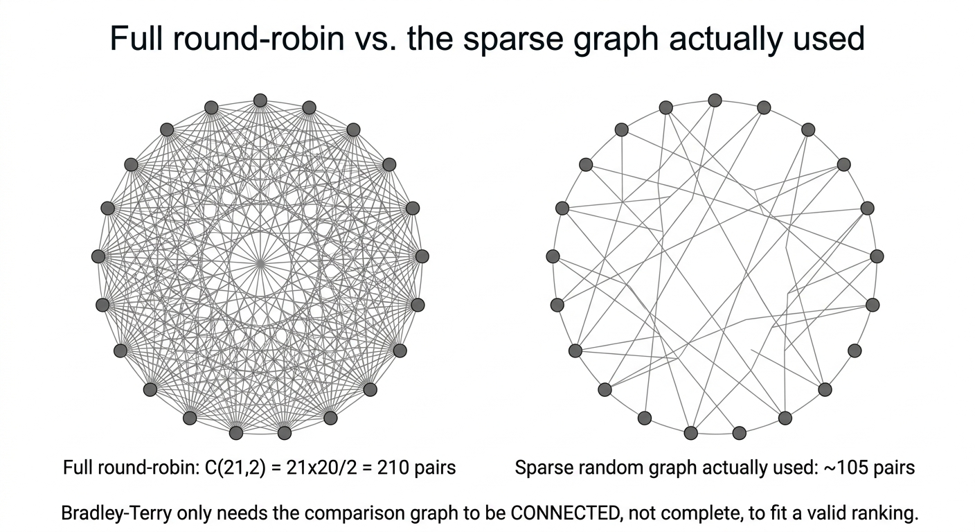
Fig 4. Full round-robin (210 pairs) vs. the sparse, still-connected graph actually used (~105 pairs).
The reason this is a legitimate shortcut and not a hidden compromise: the aggregation method below (Bradley-Terry) only requires the comparison graph to be connected — every node reachable from every other node through some chain of comparisons — not complete. 210 pairs would give a more statistically confident fit; 105 well-distributed pairs still gives a valid one.
Turning wins into one number: Bradley-Terry, worked by hand
A cover’s raw win count isn’t the answer, because not all opponents are equally strong — beating a highly distinctive cover should count for more than beating a generic one. The Bradley-Terry model solves this properly: it assigns every cover a strength gamma, such that P(i beats j) = gamma_i / (gamma_i + gamma_j), and fits all the gammas simultaneously from the observed win/loss record.
Here is the actual mechanism, worked through on a real 5-book slice of our data — The Maid, The Silence of the Lambs, Where the Crawdads Sing, The Guest List, and The Kind Worth Killing — with all 10 pairwise verdicts pulled straight from the results file. This particular subset happens to be a genuine complete round-robin: every one of the C(5,2)=10 possible pairs among these five books was actually compared in the ~105-pair sparse graph, so nothing here is cherry-picked or invented.
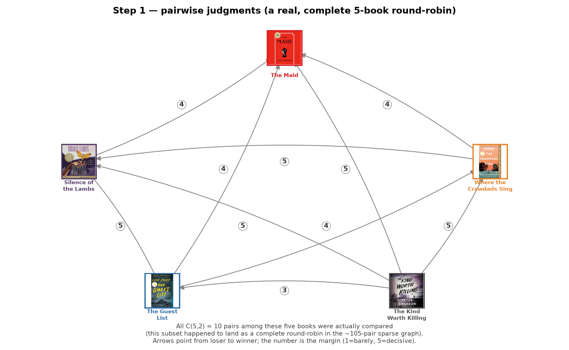
Fig 5. Step 1 — a real, complete 5-book round-robin: all 10 possible pairs among these five covers were actually compared.
Every gamma starts at 1.0 (nobody is assumed stronger than anyone else) and gets updated iteratively — each book’s new strength is its total (margin-weighted) win count divided by a sum over its opponents that depends on their current strengths.
Why “iteratively” at all — why not just compute it once?
Because the calculation is circular: The Maid’s strength depends on how strong The Silence of the Lambs and The Kind Worth Killing are (among the books it beat), but their strength depends in turn on how strong their opponents are — which loops back around. Nobody’s number can be pinned down without already knowing everyone else’s. There is no direct formula that cuts through this; the only way in is to guess, check whether the guess is self-consistent with the data, and correct it — repeatedly.
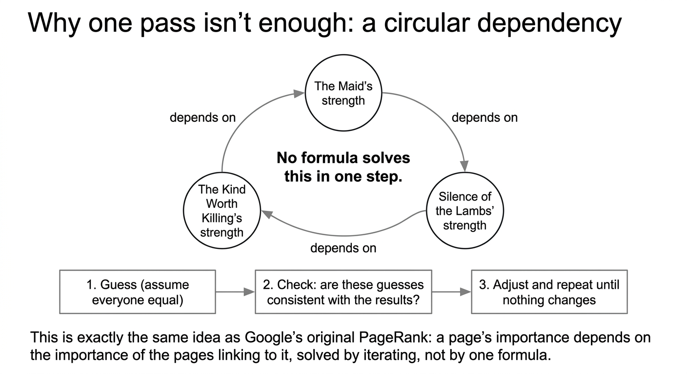
Fig 6. Why one pass isn’t enough: the strengths depend on each other in a closed loop, the same structure as PageRank.
Watch it happen concretely to The Guest List. Its only win in this slice is against The Kind Worth Killing, margin 3. At iteration 0, every book is assumed equally strong (gamma=1), so beating The Kind Worth Killing looks like beating an average opponent — a solid win. But The Kind Worth Killing loses all four of its own matches in this slice, so its gamma collapses to exactly 0 already at iteration 1. The Guest List’s own strength, though, keeps declining for many more rounds — not because that one win changes, but because The Guest List also loses to 3 of the other 4 books, and those losses keep getting reweighted as everyone else’s strength becomes clearer:
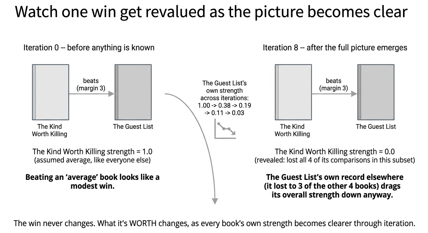
Fig 7. The win never changes; what it’s worth changes, as every book’s own strength becomes clearer through iteration.
| iteration | 0 | 1 | 2 | 4 | 8 |
|---|---|---|---|---|---|
| The Guest List’s gamma | 1.0000 | 0.3785 | 0.1877 | 0.0774 | 0.0259 |
That’s the whole reason for iterating: a one-shot calculation using the naive starting assumption (“everyone is average”) would misjudge how much a single win is worth before the rest of the picture — including the loser’s full record — has been factored in. This is the identical idea behind Google’s original PageRank — a page’s importance depends on the importance of the pages linking to it, which depends on their importance, solved the same way, by repeating until nothing changes.
Does this actually change the ranking, or just the exact numbers?
In the 5-book toy example above, stopping early wouldn’t have changed the order of the ranking, just the precision of the numbers — worth knowing, but not the strongest possible argument for iterating. So we went back to the full 21-book fit (the real ~105-comparison graph, not a toy subset) and checked, directly, whether any pair’s relative order actually flips between an early iteration and full convergence. It does:
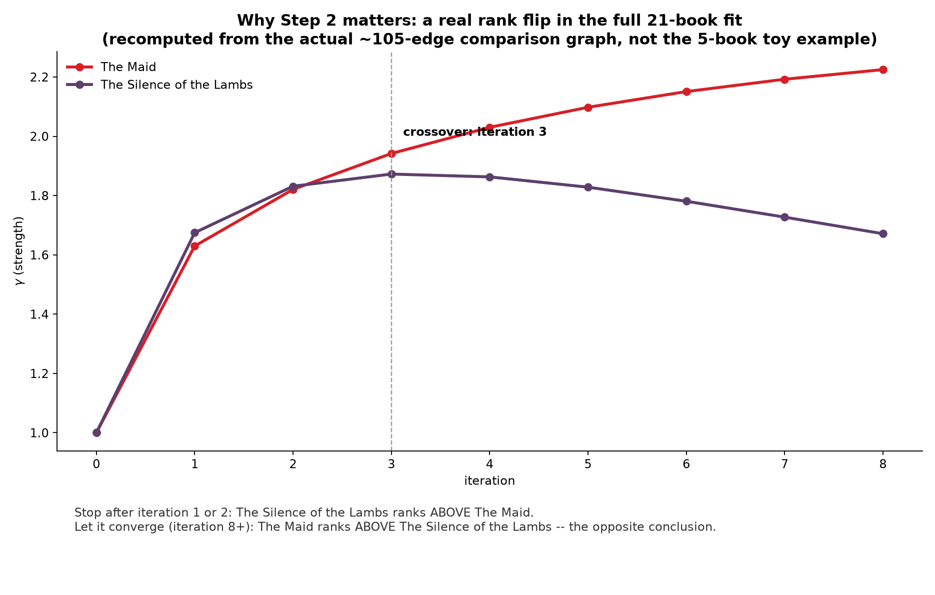
Fig 8. Why Step 2 matters — a real rank flip in the full 21-book fit: The Silence of the Lambs leads through iteration 2, The Maid overtakes at iteration 3 and never looks back.
Through iteration 2, The Silence of the Lambs (gamma 1.83) sits ahead of The Maid (gamma 1.82) — a virtual tie, with Silence of the Lambs nominally on top. At iteration 3 the two cross, and from there on The Maid pulls steadily away (2.23 vs. 1.67 by iteration 8, and 3.54 vs. 1.19 at full convergence). Stop the algorithm one round too early on the full dataset and you’d report the opposite of the converged answer for these two books — not a rounding difference, a flipped conclusion. That’s what “it takes several rounds for a book’s full position to settle” means concretely: early on, a book’s gamma mostly reflects its own immediate wins and losses; only after a few more rounds has everyone else’s strength also been factored in enough for the comparison to stabilize.
The arithmetic for iteration 1, by hand
Every node updates using gamma_new_i = W_i / sum_j( total_ij / (gamma_i + gamma_j) ), then all five values get rescaled to sum to 5 (so the average strength stays fixed at 1.0 as the numbers spread apart). At iteration 0, every gamma is 1, so every denominator term gamma_i + gamma_j is just 1 + 1 = 2 — which makes the very first update a clean, checkable calculation:
| book | W_i (sum of margins won) | sum of total_ij (all margins, win or lose) | raw = W_i / (sum / 2) |
|---|---|---|---|
| The Maid | 4+5+4+4 = 17 | 4+5+4+4 = 17 | 17 / 8.5 = 2.0000 |
| The Silence of the Lambs | 5+5+5 = 15 | 5+5+5+4 = 19 | 15 / 9.5 = 1.5789 |
| Where the Crawdads Sing | 5+4 = 9 | 5+5+4+4 = 18 | 9 / 9.0 = 1.0000 |
| The Guest List | 3 | 5+3+4+4 = 16 | 3 / 8.0 = 0.3750 |
| The Kind Worth Killing | 0 | 5+3+5+5 = 18 | 0 / 9.0 = 0.0000 |
These five raw numbers sum to 4.9539, close to 5 already — so every value gets multiplied by 5 / 4.9539 = 1.0093 to renormalize:
The Maid: 2.0000 × 1.0093 = 2.0186 · The Silence of the Lambs: 1.5789 × 1.0093 = 1.5936 · Crawdads: 1.0000 × 1.0093 = 1.0093 · Guest List: 0.3750 × 1.0093 = 0.3785 · Kind Worth Killing: 0.0000 × 1.0093 = 0.0000
Those match the “iteration 1” numbers in the chart below — nothing hidden in a solver, just this division and rescale, repeated:
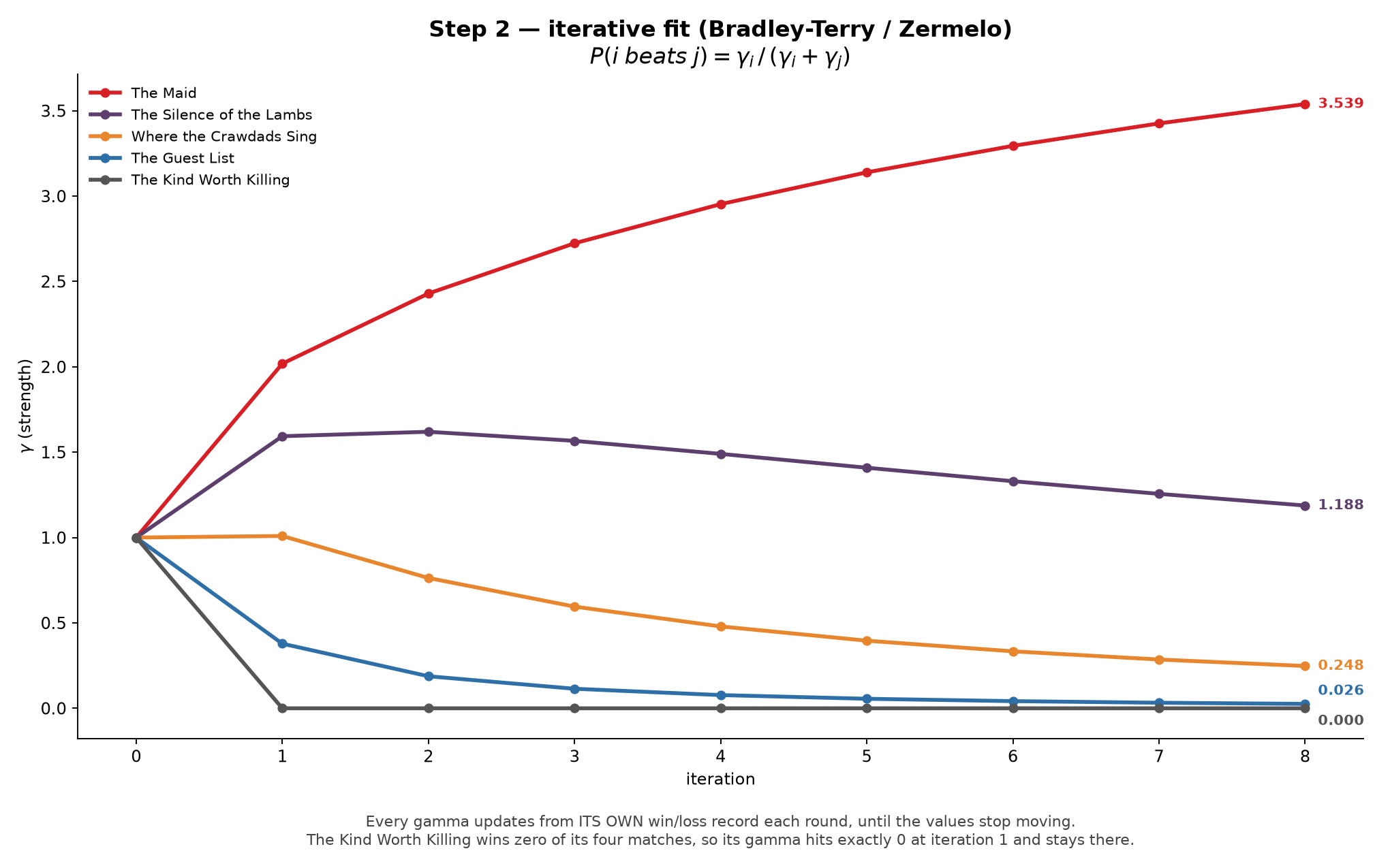
Fig 9. Step 2 — the iterative fit, all five gammas updating simultaneously each round.
The Kind Worth Killing never wins a single comparison in this slice (it loses to all four other books), so its strength gets driven toward exactly zero — the model correctly encoding “this book has no recorded advantage over anything in this subset.” Log-transform the final gammas and rescale to 0–100 (same transform used on the full 21-book fit):
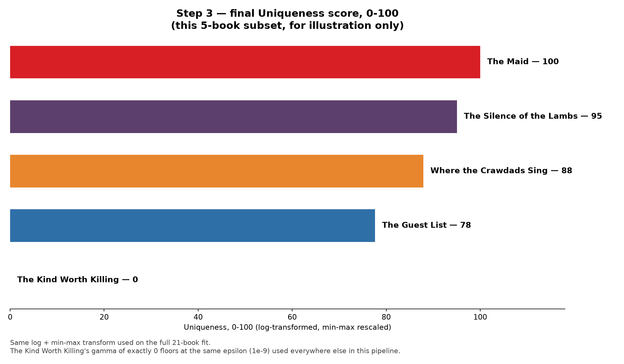
Fig 10. Step 3 — final Uniqueness score, 0–100, for the 5-book illustration subset only.
The Maid 100 · The Silence of the Lambs 95 · Where the Crawdads Sing 88 · The Guest List 78 · The Kind Worth Killing 0 — for this 5-book slice only. That ranking is a local artifact of which comparisons happened to exist in this subset, and is not the same as the full-scale ranking below. The point of this worked example is the mechanism, not a preview of the final answer.
Run the identical process on the real ~105-pair graph across all 21 covers, and the full-fit result is: The Girl with the Dragon Tattoo tops the real books at 99.7 (dominant element: colour — its saturated green palette stood out against the desaturated, moody covers surrounding it), while Mystic River and The Lincoln Lawyer both score exactly 0.0. Checking the actual comparison log confirms why: both lost every one of their 10 logged comparisons, most often to an opponent whose imagery was judged more distinctive — not because either cover is uniformly “bad” on every absolute attribute (Section 4 below shows their individual family scores are unremarkable, not floor-level), but because, head-to-head, something else in the sample consistently offered a more memorable visual hook.
4. Twelve more scores per cover — and how they relate to the one above
Uniqueness-by-pairwise-comparison answers “which cover is more distinctive,” but not “distinctive how.” For that, a separate, much larger literature review specifies 13 design element families, each with its own citation and its own anchored rating scale — colour, shape, container geometry, typography, imagery placement, complexity (split into feature vs. design per Pieters, Wedel & Batra, 2010), clutter, text load, logo/lockup design, layout, materiality, faces/characters, plus the category-relative pair (colour atypicality, overall typicality) that rounds out to 13.
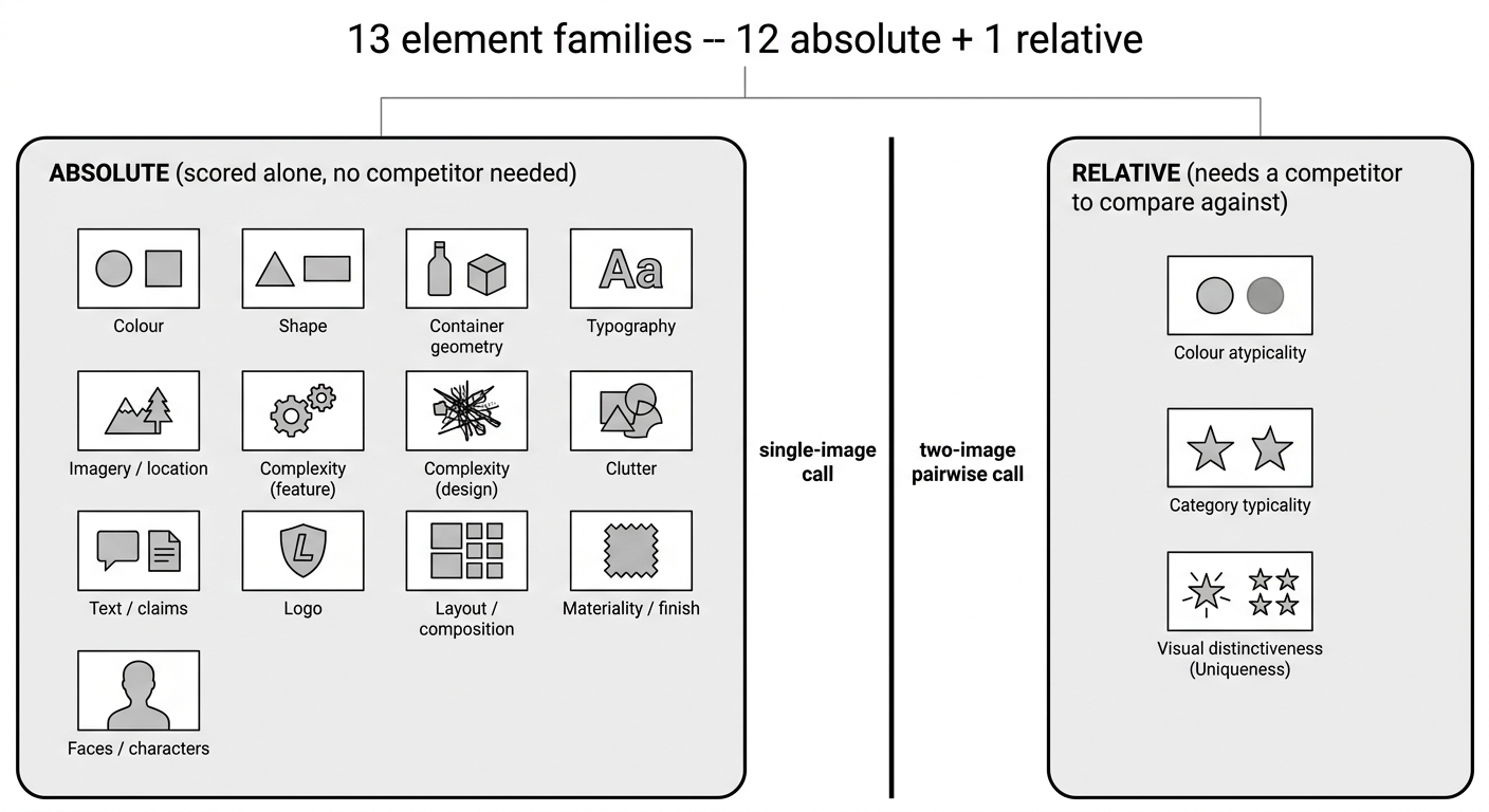
Fig 11. 13 element families — 12 absolute (single-image) + 1 relative (pairwise).
The first 12 are absolute: one image, one score, no opponent needed (a cover’s colour saturation is what it is, regardless of what else is on the shelf). Only the 13th family is inherently relative, same as Uniqueness itself.
This is the point that needs to be completely explicit, because it’s easy to conflate: the 12 absolute family scores are a diagnostic profile, not an input to the Bradley-Terry Uniqueness number. There is no formula anywhere in this pipeline that takes “colour = 4, shape = 5, typography = 3…” and produces “Uniqueness = 82.” The two systems run independently, on independent prompts, and are never mathematically combined.
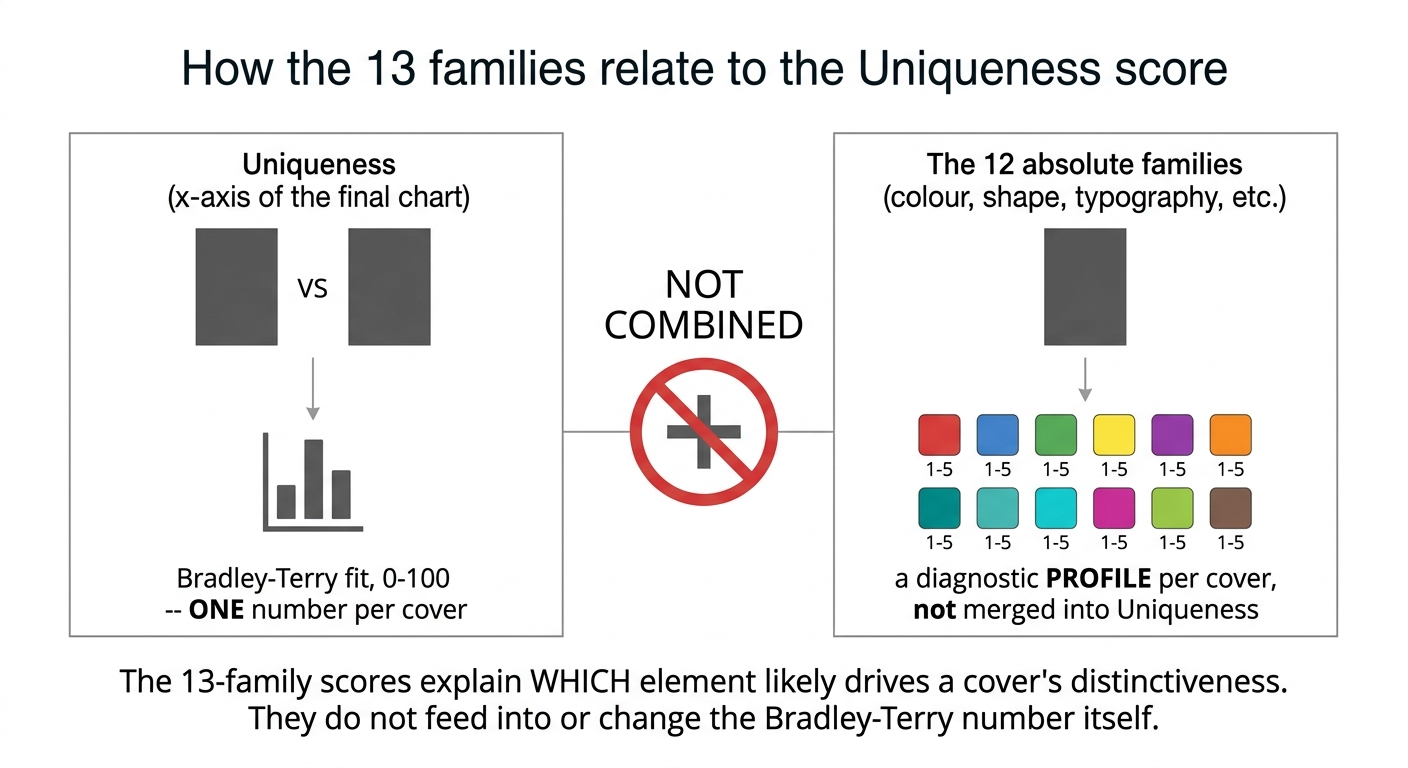
Fig 12. How the 13 families relate to the Uniqueness score: never mathematically combined.
To make that diagnostic use concrete, here are all 12 absolute-family headline scores, side by side, on three of the real covers from the worked example above — chosen because their profiles genuinely diverge, not because we picked “one good, one bad” by the Uniqueness number:
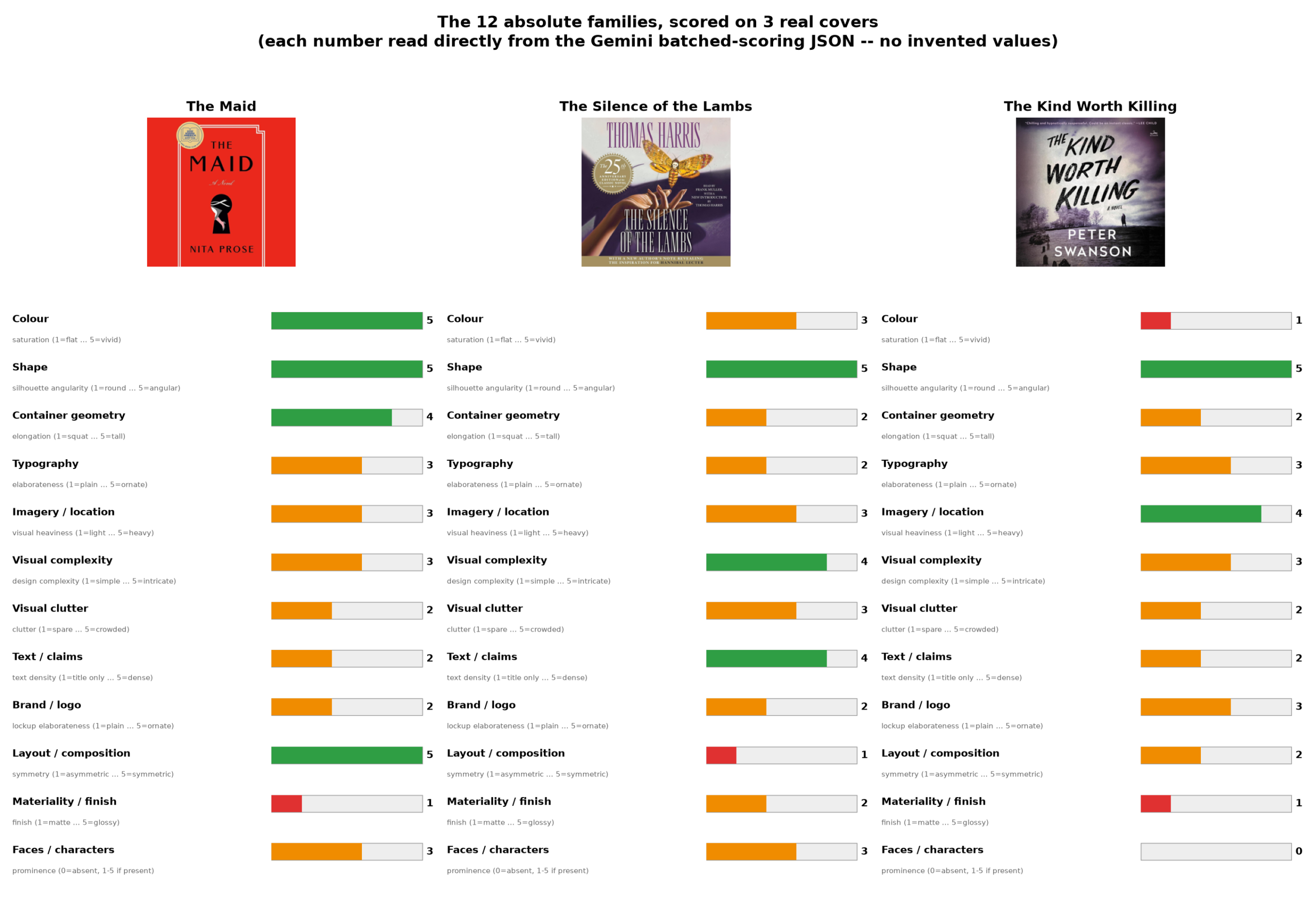
Fig 13. The 12 absolute families, scored on 3 real covers — every number read directly from the Gemini batched-scoring JSON.
Every one of these 36 numbers is read directly out of the batched-scoring JSON, not re-typed from memory — the same discipline that was missing from an earlier draft of this post, which quoted a “Mars vs. Snickers” chocolate-wrapper comparison that, on checking, had never actually been run. Here, The Maid and The Kind Worth Killing sit at opposite ends on colour saturation (5 vs. 1) and on faces/characters (a stylised figure present vs. none at all); The Silence of the Lambs sits at the opposite end from The Maid on layout symmetry (1 vs. 5). None of that ranks one cover as objectively “better” — it explains which specific dimension separates them.
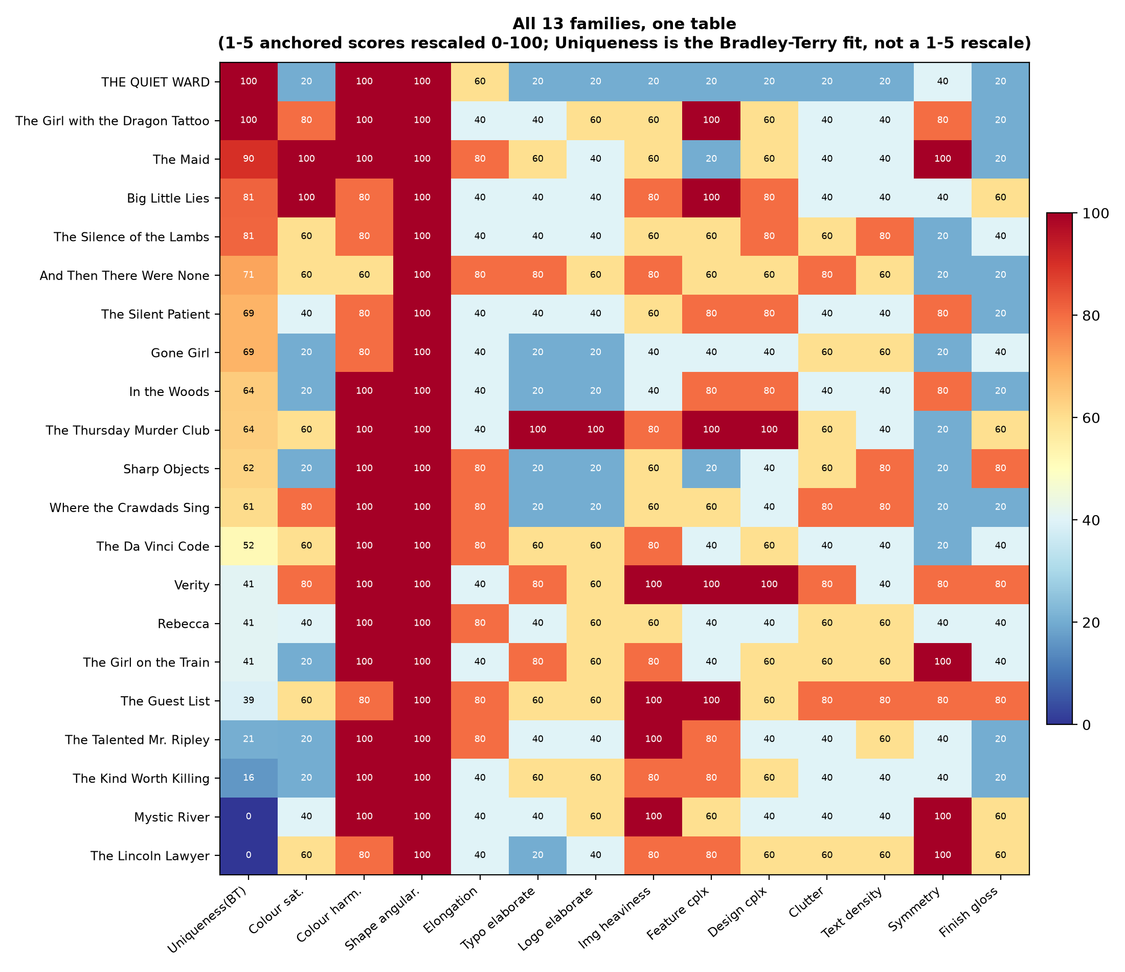
The same 12-family scoring, run across all 21 covers rather than just these three, produces one master table:
Fig 14. All 13 families, one table, across all 21 book covers.
5. The map, twice: books and movie posters
Putting it together: x-axis is the Bradley-Terry Uniqueness fit from Section 3 (the full ~105-pair graph, not the 5-book toy example). Y-axis is Fame from Section 2.
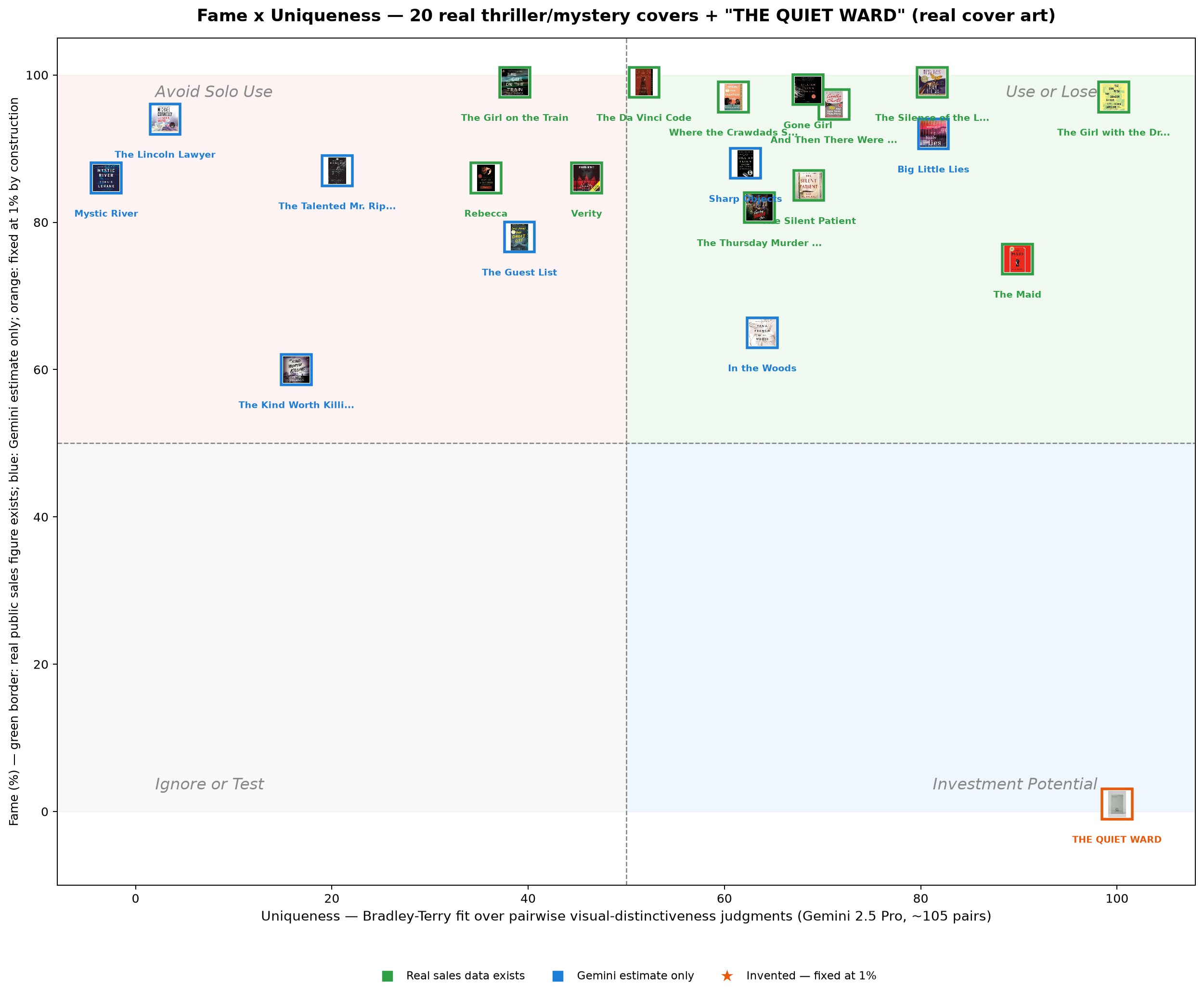
Fig 15. Fame × Uniqueness — 20 real thriller/mystery covers plus the invented “THE QUIET WARD.”
Reading it: the mega-bestsellers (The Da Vinci Code, And Then There Were None, Where the Crawdads Sing) sit high on Fame but only mid-pack on Uniqueness — familiar covers, not necessarily distinctive ones. THE QUIET WARD, the invented cover, lands at high Uniqueness with Fame pinned at 1% by construction, because a never-published book cannot have exposure history no matter how its design scores — it sits squarely in “Investment Potential,” not because we decided it should, but because that’s where its actual pairwise win record and its actual absence of sales history place it, computed the same way as every real point on this chart.
To check whether any of this is an artifact of the book-cover category specifically, we ran the identical pipeline — same prompts, same Bradley-Terry fit, same 12-family taxonomy — on a second domain with a completely different Fame situation: movie posters, where worldwide box office is a near-universal disclosure norm rather than the exception.
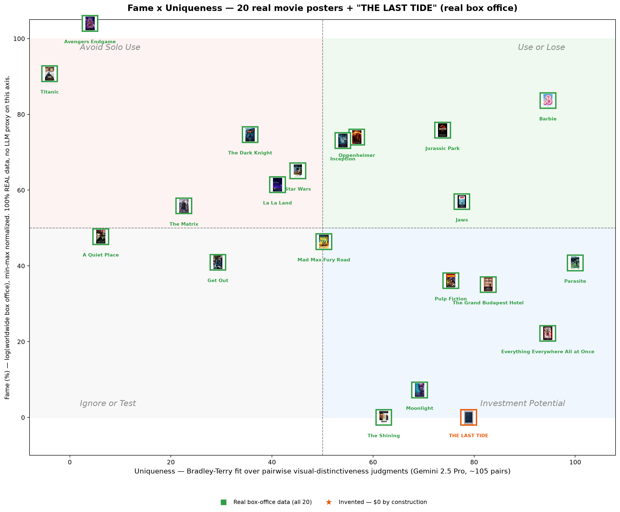
Fig 16. Fame × Uniqueness — 20 real movie posters plus the invented “THE LAST TIDE,” Fame from 100% real box office, no LLM proxy.
Here Fame needed no LLM proxy at all — all 20 real films have a publicly reported box-office figure, log-transformed and min-max rescaled onto the same 0–100 axis. The pattern rhymes with books: the highest-grossing blockbusters (Avengers: Endgame, Titanic) cluster at the very top on Fame but score 0.0 on Uniqueness — both lost every one of their 10 logged pairwise comparisons. The two lose for different reasons, and the observation log says so directly: Avengers Endgame’s poster is “a dense collage of more than a dozen characters layered over one another,” a composition convention several other posters in this mixed 21-film set were judged to break from more sharply; Titanic’s is a widely recognizable but comparatively conventional “man and woman in a romantic embrace superimposed above the bow of a large ocean liner” — famous, but not, in this particular 21-poster field, the most visually distinctive design. Parasite tops the Uniqueness axis at 99.99 (via imagery), and Barbie is the closest thing to a “both famous and unique” outlier in the set, the “Use or Lose” quadrant almost nothing else here reaches.
6. What this does and doesn’t prove
Every number in this post came from one model (Gemini 2.5 Pro), one construct definition, one sparse comparison graph per domain, sampled once per pair instead of the 5-times-both-orders the source methodology specifies. That’s a real, stated limitation, not a hidden one. Two domains, two very different Fame situations (books: 60% real coverage plus an LLM fallback; movies: 100% real, no fallback needed anywhere), and the same qualitative pattern held in both: Fame and Uniqueness are not the same kind of measurement. One is recoverable from pixels with a defensible, auditable method; the other fundamentally is not, and the honest move is proxying it from real data where any exists and flagging every point where it doesn’t, rather than pretending a single pipeline measures both.