#028 PyTorch – Visualization of Convolutional Neural Networks in PyTorch

Highlights: In this post, we will talk about the importance of visualization and understanding of what our Convolutional Network sees and understands. In the end, we will write code for visualizing different layers and what are the key points or places that the Neural Network uses for prediction.
Tutorial Overview:
- History
- Introduction
- Visualization with a Deconvnet
- Saliency and Occlusion
- Visualization and understanding CNNs in PyTorch
1. History
A bit of history about CNN’s, back in 2013., they demonstrated impressive classification performance on the ImageNet benchmark led by the work of Krizhevsky. However, there was no clear understanding of why they performed so well. There was a question, might they be improved?
This outstanding paper introduced a novel visualization technique that enabled insight into the functioning of intermediate CNN feature layers and the operation of the classifier. Seen as a diagnostic tool, these visualizations allowed the researchers to find architectures of a model that outperformed Krizhevsky et al. on the ImageNet classification benchmark. Let’s see and explore this super cool paper and even cooler visualizations of CNNs using PyTorch.
2. Introduction
In 2012. Alexnet was introduced and beat the current state-of-the-art results on Image net: error 16.4% whereas the second-best was 26.1%. The Deep Learning field exploded! Many other results proved the superiority of Deep Learning. Advancements in GPU implementations and the creation of super large datasets allowed very fast progress. Yet, the mechanism behind the success of the CNNs was still quite unknown and unexplored. Little was known about the behavior of these complex models and why they were achieving such an outstanding performance.
The novelty of this work is that instead of trial-and-error improvements, they proposed a specific way to create an input stimulus that would excite certain activations in the CNN layers. Creating such stimuli was a very insightful step. Moreover, the researchers conducted a series of experiments where an image can be occluded, and then, they would exactly reveal which part of the scene is important for the classification. Last but not least, using visualization methods and by observing the evolution of filters’ features maps during the training it was possible to diagnose what was problematic with the model.
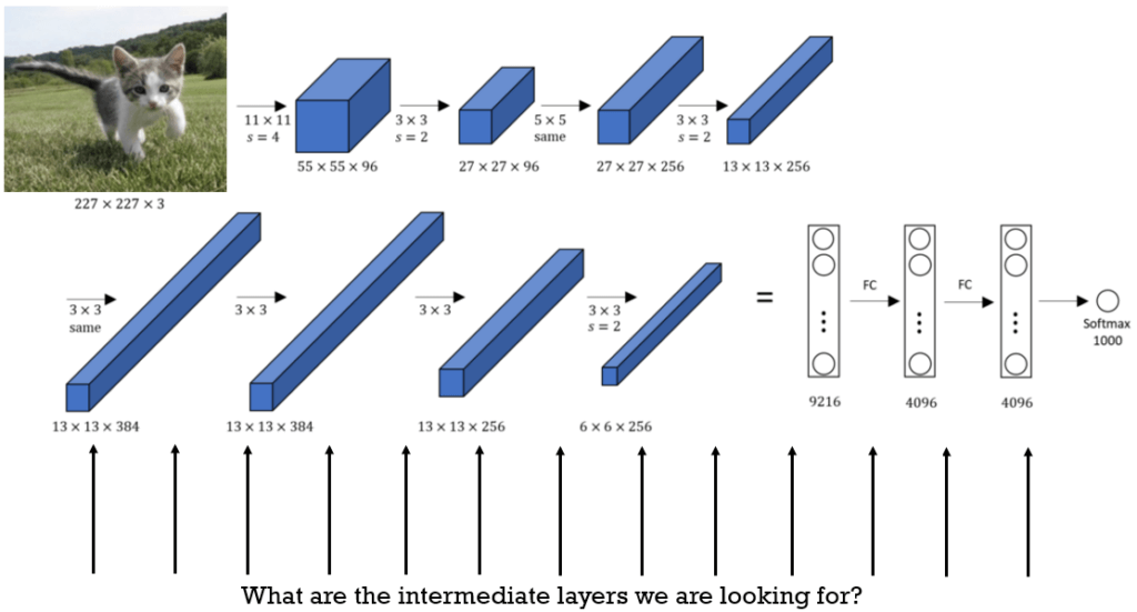
Originally, the network that the authors were experimented with was a standard AlexNet that consists of:
- Pooling layers
- Relu activation function
- max pooling layers – optional
- Normalization layers – optional
- Fully connected layers
The network itself was trained on the ImageNet dataset using backpropagation and stochastic gradient descent (SGD).
3. Visualization with a Deconvnet
When we feed a certain image into a CNN, the feature maps in the subsequent layers would be created. Commonly, some of these feature maps would be more excited for a certain input stimulus.
Think of it this way. Some filters will learn to recognize circles and others squares. So, when we have circles in the input image, the corresponding filters will show high activation in the feature map. That is, they will be excited. On the other hand, the filters that learned to recognize squares will generate feature maps with practically zero level output.
How are we going to explore what different filters learned? One approach is to attempt to generate an input pixel image that would excite only that filter, or at least a similar subset of filters. This means that we should go in reverse. From the excited feature maps, we will go in reverse and try to figure out the ideal pixel image that would excite a particular filter.
This actually can be done, and this process is known as deconvolution.
How can we achieve deconvolution?
Well, the idea is to go back from the feature maps in the opposite direction and create an input pixel image.
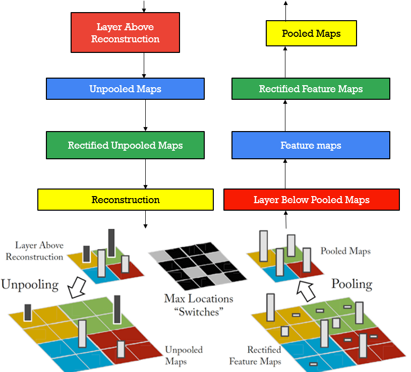
The deconvolution process is shown in the image above. First, we do a regular feature map calculation or the so-called forward pass. For the desired filter layer, then, we stop and calculate the responses. We set all responses of other filters to zeros, and continue processing in the opposite direction:
We successively apply:
- Unpooling
- Rectification (ReLU)
- 2DConv – Filter to reconstruct the activity in the layer beneath
We repeat this process until the shape of the input image is reached.
Let’s review these steps in more detail:
Unpooling – Once we perform a max-pooling operation, ¾ of the data is lost and we cannot recover them. However, one possibility exists and a little bit of hope. We can record the location where the maximum was present, so when we go back from features towards pixels, we will know where the largest value was in a local neighborhood (e.g. in a 2×2 matrix square).
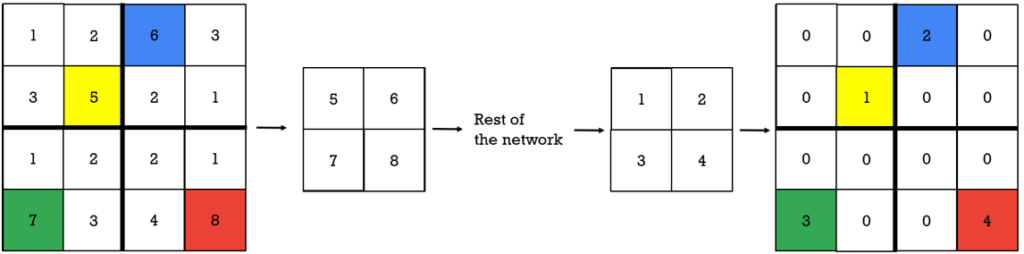
This is illustrated in the image above. So, we remember the indexes of the positions of the maximum numbers, and this way we know where it was located in the local neighborhood.
Then, in the deconvnet, these switches or locations are used to preserve the structure of the stimulus.
Rectification – The convnet uses ReLu, so once again, the negative values would be truncated, and therefore, lost in the forward pass. Therefore, the feature map is always positive. Hence, when we pass the signal backward, it should also be positive.
Filtering: The convnet uses learned filters and convolve feature maps from the previous layers. So, how can we reverse this process? We can do it approximately by using a transposed version of the same filter. This is also applied in decoder-encoder architectures. In practice, this means that each filter is flipped horizontally and vertically.
So, let’s see those marvelous results that for the first time visualized many interesting concepts related to CNN.
Once we have trained a neural network we use a validation dataset. We select a particular filter and for all the data we record the maximal activation. Since feature maps have only positive values (due to using ReLU), we can simply sum all the elements. This total sum will represent the overall activation for that filter. Then, we find the images that maximally excite this filter. Moreover, we select nine images in the validation set that produces the largest activation. Then, for these images/patches, that are shown in the images below we perform a deconvolution.
The deconvolution will produce gray-like images. This process is also referred to as project back to pixel space.

Let’s first observe the results of the first layer in the image above. So, nine different filters are selected. For each of these filters, we have recorded activations that were generated from the input images that were selected from a validation dataset. For instance, we can see that the filter (1,1) is highly activated when we have diagonal edges following the top-down direction (135 degrees). Filter (3,2) will be active when the inputs are green patches as we can see.
Similar experiments are repeated for the higher layers from 2-5. However, now the images that are obtained in the process of deconvolution are more and more complex and also have a hierarchical form.

We can see that in the second layer, these filters learned patterns like squares and circles. Note that some of them have diagonal stripes or circular concentric lines.
Therefore, on the right, we have image samples from the validation dataset after the network is already trained. Then, we go to layer 2 and record the highest activation among the filters.
We use this recorded activation and go back in the opposite direction using a deconvnet approach. In this way, we get the “gray images on the left”. We have repeated this one more time as these images can be confused with a simple plotting of filter coefficients values. This simple process can be sometimes applied effectively, but only for the first layers’ filters.

In addition, we can see that layers 4 and 5 after the deconvolution step generate rather complex and interesting patches. In all of them, for a certain filter, we can see a large similarity. For instance, there are filters that can be used to detect dogs, flowers, or car wheels.
The visualization was nice and interesting! It allowed us to gain a deeper understanding of the filters and the term “hidden layers” is created for a reason. Now, they are demystified.
But, how can we use these insights to improve our network?
First of all, if we want to improve the network, this can only be done in the process of training.
Hence, the idea is to observe the training of the network and perform visualization. We do know, of course, that the filter coefficients evolve over training time, so this visualization step can assist us to get additional ideas of whether everything is going according to the plan.

Here, we can see a subset of random filters for each layer. From each layer, 6 filters are selected (shown as rows). Then, they are visualized during the training process for different epochs. Similarly, as in the previous visualization experiment, we performed a deconvolution
First, across all training samples, a feature map is stored when the highest activation was registered. Then, we go back from this activation into the pixel space and reconstruct the image. This is how these images are obtained. Just to make sure, these are not plotted coefficients from the filter. To repeat, they are images obtained in the process of deconvolution for the image that created the largest response for this filter.
And how can this help you may ask? This is done for different epochs, and in particular, they were: 1,2,5,10,20,30,40 and 64. Note how the reconstructed images by use of deconvolution generate better and better images, resembling more and more the patterns that initially excited this filter. We can say that this was an example of successful training. However, sometimes, it can happen that this process of improvement is interrupted, and we may end up with corrupted filters that haven’t managed to learn a useful structure.
4. Saliency and Occlusion
Now, we will present another rather simple, but strikingly effective experiment performed by researchers. Imagine that you create a patch and cover (destroy) part of your image. Then, you look at the output probability score.
Intuitively, if you cover an unrelated part of the image. For instance, background objects, your classification score would not be affected a lot. On the other hand, if you cover the most important part of the object your score would be affected significantly.
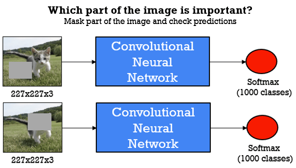
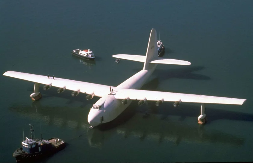
Why can this be so important? Well, imagine that you have a plane and you get a successful classification score. The question is: what the network has learned, the plane or maybe the sky? That is if you have a plane on the water, will it still be recognized without a sky in the background?
Commonly, this kind of occlusion experiment generates an output map. For this example, in the image below, we will place the gray square over the dogs back legs, and we can see that the probability score is showing a strong blue color over the dogs head. So, indeed the network learned to recognize and localize the dog itself.

Saliency backprop
There is, yet an additional experiment, that can be of great value when analyzing Neural Networks. Here, we take the input image of a dog, pass it through the network and calculate the classification probability of the dog. Then, we can ask the following question:
If we change one pixel in our input image, how much will it affect the final probability score?
Well, first of all, one way to calculate this is to perform a backpropagation and to calculate a gradient of the score with respect to this pixel value. This is easily doable in PyTorch. Then, we can repeat this process for all pixels and record the gradient values. As a result, we will get high values for the location of a dog. Note, that in this example we get a “ghostly image” of a dog, signifying that the network is looking in the right direction!
The next question is: Can we use backpropagation for the feature map values of intermediate layers instead of the output probability score as well? Well, it seems that the results, in this case, are not amazing. Therefore, we cannot determine with backpropagation efficiently how the intermediate layer responses will be affected by the input pixel value.
Guided backpropagation
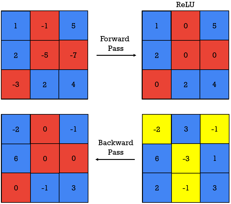
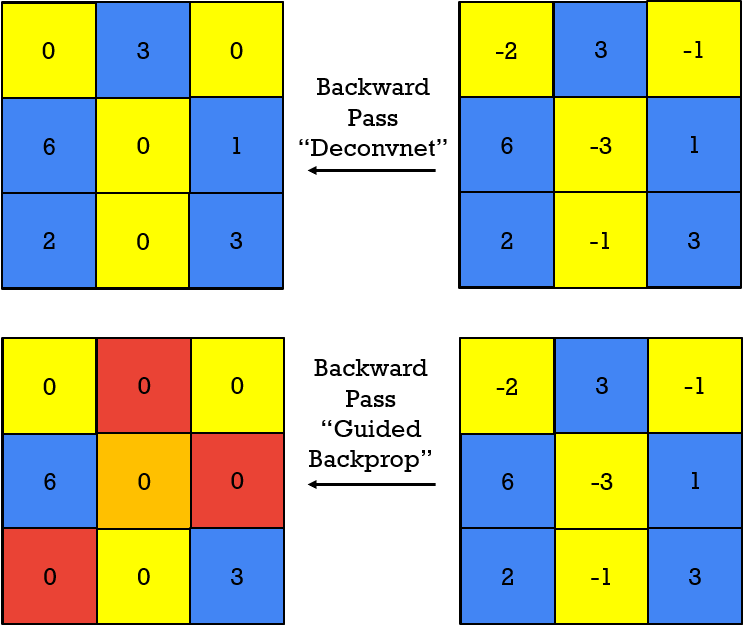
To solve the challenges with the guided backpropagation, we will now introduce another method for visualization. It is known as a guided backprop. The process is similar to the backprop, but there is one difference. Let’s explore it. Observe the following feature maps (\(3\times3 \)) and the subsequent forward and backward pass in the images below.
First, we have a forward pass, and ReLU will clip the negative elements and store zeros instead. Then, we have a backward pass within the backpropagation, and a similar process will be repeated if we go in the opposite direction. However, here, the “stored” forward pass values, will affect the truncation and negative values may pass backward.
Next, as shown in the image below, we will use a “deconvnet” backward pass. In this case, the result is similar to the “ReLU in the opposite direction”, and does not pay attention to the previous forward pass. Finally, when we combine approaches: backpropagation and deconvnet, we will obtain a new approach “guided backprop”. In this case, as demonstrated empirically, we will get much nicer visualization results.
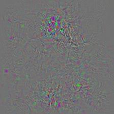
The results of the guided backprop can be seen in the following images. Now, the corresponding filter patches reveal how the input image looks like, and how it would produce a high activation value for this filter. This clearly demonstrates what set of pixels is the most dominant to cause the corresponding activation.
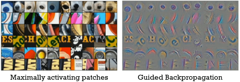
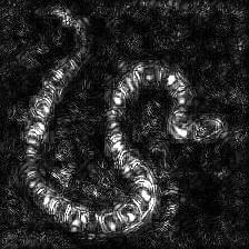
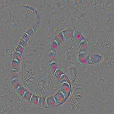
With guided backpropagation, we can see in the image above that the eyes of the dogs were the most important (first row). In the third row, we can see that the most important were the letters, and so on. One very interesting example is the backprop done on an image of a snake, you can see that example on the image below.

5. Visualization and understanding CNNs in PyTorch
To further demonstrate the practical applicability of these methods, we will demonstrate how these methods can be applied using PyTorch. For this, we will rely on this amazing GitHub repository.
The main idea is that these examples will use a pre-trained CNN. For instance, we can use a pre-trained AlexNet network, that was trained on ImageNet. Then, for a single input image, we will calculate the output probability score, and then we will go back and generate the input image using the backprop.
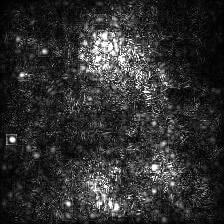
Let’s see how we can do this. We will use the image of the snake above as input and see the results. The image is shown below.

To start, we first need to download the code from GitHub. This is pretty simple, to do this, just run the code below.
# If using google colab add a ! sign behind the code
# Like this: !git clone https://github.com/utkuozbulak/pytorch-cnn-visualizations

git clone https://github.com/utkuozbulak/pytorch-cnn-visualizations
As our code finishes downloading, we need to navigate inside of the repository. This is also fairly simple, by using the command cd. We will enter the repository and then the src directory in which the code is stored.
cd "/content/pytorch-cnn-visualizations/src"By exploring the repository, we can see that we have several folders. The folders are:
- input_images – here we will place our images that we want to process, for this example the snake photo
- results – our results will be stored in this folder
- src – the folder in which we are currently in, the folder with all the code
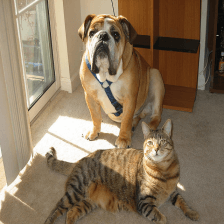
If you used the code above to download the repository ( git clone ) you will have the cat and dog image already downloaded and stored in the input_images folder. Now, the only thing left to do is run the script to calculate the guided backprop.
# if using Google Collab run the code with a ! sign before python
python guided_backprop.py
When the code finishes running, you will end up with two images inside of the results folder. One image is in Grayscale and one in RGB.
We can see that the model’s layers are activating when they see this particular snake pattern. Now, let’s not stop here, let us see how the code actually works. For this, we will open the guided_backprop.py file and look at its elements.
To see even more examples, let us try a different image with a different backprop. For example, the vanilla_backprop.py.
Our input was the image on the left, the cat and dog image, and on the right, we can see the results in grayscale and RGB. Looking at the results, we can see clearly that the most activated parts were at the dog’s head and also the cat’s head. So, we can see that the algorithm learned to distinguish and localize the cat and dog in this picture.
So, we will cover these two examples, but there are even more backprop methods. Feel free to further explore this outstanding visualization library!
Happy viz!
Summary
Training a deep convolutional network can seem like a mechanical task without the proper tools to explore what exactly is going on within the intermediate CNN layers. In this post, we have explored some of the initial works to unveil CNN secrets. Moreover, we have additionally explored saliency, backprop, and guided backprop. We demonstrate an effective visualization that can be obtained with a marvelous visualization toolbox in PyTorch. Till next time!