dH #012: Understanding Nearest Neighbor Classification: From Visual Examples to Decision Boundaries
*Exploring how nearest neighbor algorithms work through visual analysis and the transition to k-nearest neighbors for improved classification*
—
## What Does Nearest Neighbor Classification Look Like?
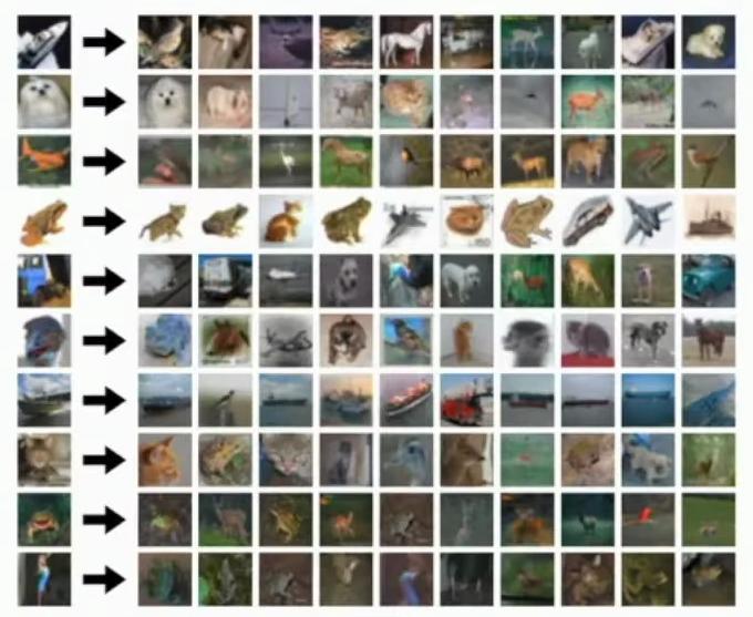
The slide titled ‘What does this look like?’ displays results of nearest neighbor classification on the CIFAR-10 dataset through a grid of related images. Here what we’re showing is the results of nearest neighbor classification on the CIFAR 10 data set.
Grid of image rows showing test images and their nearest neighbors
The leftmost column shows test examples from the CIFAR-10 test set, with each row containing 10 nearest neighbor matches from the training set. Each row displays the nearest neighbors from the training set corresponding to the test example on the left, showing visual similarities across images.
## The Limitations of L1 Distance
So this L1 distance that we’re using to compute nearest neighbors is really not very smart. **And it doesn’t know much about what it’s looking at.** This highlights a key limitation of current AI systems, which is their lack of true understanding or knowledge about the data they process.
And we can kind of look, we can kind of get a sense for maybe how poorly this might perform if we look at which of these one nearest neighbors are correct or incorrect. But what I’ve tried to do is draw red boxes around the one nearest neighbors that are incorrect and green boxes are on the one nearest neighbors that are correct.
**And this gives you a sense that even though images can look very visually similar as measured by this L1 distance, they actually can sometimes have very different semantic meanings.** The sentence highlights the key concept that visually similar images can have different semantic meanings, which is a core concept in understanding the limitations of using L1 distance as a measure of similarity.
So this is clear maybe in the fourth row, when you see this kind of brown blob surrounded by a white background, I think it’s a frog. But then its nearest neighbor is actually a cat. So then the cat is also a brown blob in a white background. But so it looks very visually similar by this L1 metric, but the label is different. So we would make an incorrect classification on this thing.
## Understanding Decision Boundaries
**So this is one way to think to sort of get an intuitive understanding for what a nearest neighbor classifier is doing.** Another way to think about nearest neighbor classifiers is through this notion of decision boundaries that we can see in this plot that needs a bit of unpacking.
### Nearest Neighbor Decision Boundaries
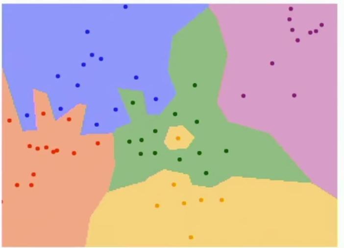
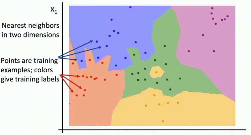
The slide demonstrates nearest neighbor classification boundaries in a two-dimensional space representing pixel intensity values. The plot shows different colored regions representing decision boundaries, with scattered points of matching colors distributed across these regions.

Colored region plot showing decision boundaries with scattered dots
Each colored dot represents a training example, where the color indicates its classification category, creating distinct decision regions in the feature space. So then the x-axis here is the value, the intensity value of one of our pixels, and the y-axis here is the intensity value of another of our pixels.
Multi-colored decision boundary plot with scattered points
The slide illustrates a two-dimensional space where different colored dots represent distinct training examples for classification. So maybe red dots are cats and blue dots are dogs and so on and so forth.
The colored background regions represent decision boundaries, showing which category label would be assigned to any point in that space using nearest neighbor classification. And now the color of the background region represents the category label that would be assigned to that point in space if we were to run nearest neighbor classification for one of those test images.
For example, points near the orange region would be classified as belonging to the orange category, as they are closest to the orange training examples. So for example, in this red X here, we can see that the nearest neighbor in the training set is maybe this red dot here, which means that if we were to perform nearest neighbor classification for this red X, we would predict the red category.
Orange region with training examples
## Problems with Noisy Decision Regions
**The decision boundaries between different categories create distinct regions in the feature space.** So then what’s interesting to look at here is the decision boundaries between different categories. The boundaries separate regions that would be classified as green from those that would be classified as purple, among other category pairs.
**When we examine the nearest neighbor classifier visualized this way, several interesting patterns emerge.** The decision regions can be very noisy and susceptible to outliers, as shown by the irregular boundaries between categories. One is that these decision regions can be very, very noisy and are subject to outliers.
For instance, there’s a single yellow point surrounded by green points in the training set. So for example, we see that in our training set, we’ve got this one yellow point kind of sitting out in the middle of a whole bunch of green points. This could potentially be a mislabeled training example that should have been green instead of yellow. And maybe that’s noise, maybe actually it should have been labeled as green instead of yellow.
The nearest neighbor classifier creates a yellow decision region around this isolated point, affecting the classification of nearby test examples. But when we use this nearest neighbor classifier, the presence of a single yellow point in this cloud of green is going to cause a bunch of test examples around that yellow point to be classified as yellow.
Yellow decision region around isolated point
On the left side of the diagram, there’s a jagged decision boundary between the orange and blue classes. We can also see over here on the left side of the screen, we’ve got this kind of jagged decision boundary between the red class and the blue class. This jagged pattern occurs because relying solely on the nearest neighbor for classification can produce noisy results. And maybe, and again, this is because this relying on only the nearest neighbor to perform the classification can be a bit noisy.
## Introducing k-Nearest Neighbors
**This raises the question of how we might smooth these decision boundaries for more robust classification.** So then the question is, what might we be able to do to kind of smooth out these decision boundaries and maybe give us a more robust classification? One potential solution is to consider more than just the single nearest neighbor. So one idea is to simply use more neighbors.
### k-Nearest Neighbors
The k-Nearest Neighbors algorithm can be implemented in two ways: using a single nearest neighbor or considering multiple neighbors for classification. So so far, we’ve talked about the nearest neighbor classifier as simply parroting out the label that is attached to the nearest training example to each test example.
Comparison of K=1 vs K=3 classification regions
Instead of using just one nearest neighbor, we can leverage multiple neighboring points for classification. But what we can do instead is use more than just that one nearest neighbor. The algorithm considers K nearest neighbors and combines their category labels to make a classification decision. Instead, we can consider some set of K nearest neighbors and then imagine some way of combining the category labels of each of our K nearest retrieval, nearest retrieval results.
**One simple approach is to take a majority vote among all the category labels of the K nearest neighbors, as shown in the comparison between K=1 and K=3 classifications.** But one simple idea is to simply take a majority vote among all the category labels of each of our K nearest neighbors.
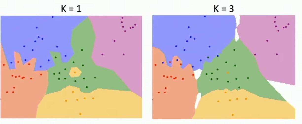
### Comparing K=1 vs K=3
The visual comparison reveals interesting differences between K=1 and K=3 implementations. **The decision boundaries show marked differences between K=1 and K=3 classifications, particularly in their smoothness.** So then once this picture of the nearest neighbor classifier using decision boundaries, let’s see some of the difference between K equals 1 and K equals 3.
**The decision boundaries become notably smoother when using K=3 compared to K=1.** So one is that our decision boundaries got a lot smoother. With K=1, the decision boundaries appear more jagged and noisy due to reliance on single neighbors. So you can see that when we used K equals 1, recall that our decision boundaries were very noisy as a result of only using one neighbor.
Using three neighbors for classification results in more stable and smooth decision boundaries. And now, if we use three neighbors instead to perform classifications, we get much more stable and predictable results.
Visual demonstration of boundary smoothing
### Advanced k-NN Considerations
The slide demonstrates K-Nearest Neighbors classification with two different values of K, showing how the decision boundaries change between K=1 and K=3. Using more neighbors helps smooth out rough decision boundaries, as clearly shown in the comparison between K=1’s jagged boundaries and K=3’s smoother regions.
Side-by-side comparison of K=1 vs K=3 classification boundaries
**With K=3, the white regions in the visualization represent areas where the three nearest neighbors belong to different categories, creating tie situations that need to be resolved.** So now, even though we still have this one yellow point hanging out in a cloud of green, it no longer affects, it no longer results in this yellow classification region.
And similarly, this region between red and blue has somehow got a little bit smoothed out by using more than one nearest neighbor. But there’s another problem, which is that when K is greater than one, there might be ties between classes.
So in this visualization, these white regions all have three nearest neighbors that are all, that are all of different categories. **So somehow you need some mechanism for breaking ties.** And maybe you could have, you can imagine maybe having some heuristic then based on the distance, maybe you back off and use the one nearest neighbor result. **There’s different heuristics you might imagine in this situation.**
## Distance Metrics and Their Impact
So another thing, another thing that we might want to change or play around with as we, when we do the nearest neighbor classifier, is changing the distance metric that we use to compute similarity between images.
**So so far, we’ve talked about using this L1 distance between images, which we’re called was the, the sum of the absolute differences between all the corresponding pixels and the two images.** Another common choice is the L2 or Euclidean distance between the images, between the pixels of the image.
**So this has the effect of, you know, taking basically what we’re doing here is taking the pixels of the image, stretching it onto a long vector, then imagine computing the Euclidean distance between points in a high-dimensional space for those two images.**
And what’s interesting is if we flip back to this, this picture of nearest neighbors using decision boundaries, you can see that as we use different distance metrics, we get sort of qualitatively different properties in the decision boundaries that arise.
### Geometric Properties of Distance Metrics
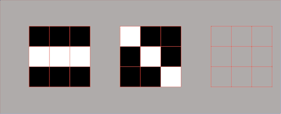
But with L1 classification, we can see that all of the decision boundaries between categories are all composed of access aligned chunks. **They’re either vertical line segments for horizontal lines, segments or vertical lines, or 45 degree angle line segments.**
**But when we use the L2 or Euclidean distance class, if we use the Euclidean distance instead to compute nearest neighbors, then now our decision boundaries are still piecewise linear, but those lines can appear at any orientation in the input.**
**So somehow using different distance distance metrics somehow is a way that you as the human expert can imbue some of your own human knowledge into the structure that you want the algorithm to take account of.** So it’s a little bit unclear maybe for whether L1 or L2, whether that’s going to make big differences, it’s not really intuitively clear what semantic differences in L1 versus in L2 distance metric is going to result in for the case of image classification.
**But what’s really interesting about the K-nearest neighbor algorithm is that basically if we choose different types of distance metrics, we can** fundamentally change how the algorithm perceives similarity and makes classification decisions.
## Setting Hyperparameters
**When setting hyperparameters, there are three main approaches to consider for algorithm performance on truly unseen data.** This represents one of the most critical aspects of machine learning practice – ensuring that our models will generalize well to new, unseen data rather than just memorizing the training examples.
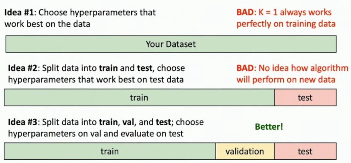
Three approaches to hyperparameter selection with data splits
### The Problematic Approaches
The first approach of using all data for hyperparameter selection is problematic, as setting K=1 always works perfectly on training data but fails to generalize. So even though this is the correct thing to do, it’s actually completely terrifying in practice, right?
**The second approach of splitting data into train and test sets still has a fundamental flaw – it provides no insight into how the algorithm will perform on new data.** So when you’re writing a research paper, you’ve been working on this project for months, you’ve been working on this project for years and that entire time you’ve been tweaking your algorithm, you’ve been tuning it, you’ve been lovingly trying to improve it and throughout the entire process of developing your algorithm, you as a good machine learning practitioner have never touched the test set.
### The Better Approach: Train-Validation-Test Split
The third and better approach involves splitting data into three parts: training, validation, and test sets, where hyperparameters are chosen using validation data and final evaluation is done on test data. You’ve only evaluated on the validation set and then it’s the week of the deadline.
**It’s finally time to see how well your algorithm actually does and then a week before the deadline is the only time you should run it on the test set.** Even though this is terrifying, right? **What if my entire life’s work has been wasted on this algorithm?**
**So if it turns out that you get a bad performance in the test set, that means your algorithm was bad and maybe it shouldn’t be published.** **So this is actually, this is very terrifying to work with in practice, but this is the correct way to do data hygiene and machine learning and projects have been sunk by getting this wrong.**
**If you get this wrong, you, not only, I mean, you might get your papers accepted, but you’ll be fundamentally dishonest about how well your algorithm performs out there in the wild. And that’s actually the point of building machine learning models at all.**
**So even though this is terrifying, this is the right thing to do and you should always do it when you’re working on machine learning problems.**
### Cross-Validation: The Most Robust Approach
**And idea three, the basic trick was to split our data set into three chunks, but we can do even better.** Why stop there? **We can split our data set into ever more chunks and get ever better estimates of our generalization performance.**
**So that’s idea number four called cross validation, which is maybe even the best idea that we really should all be doing.** **So here the idea is we’ll split our data set into many, many different chunks called folds.**
And now what we’re going to do is iterate through them and use, and maybe in this example, we have five folds. So we’ll try out five different versions of our algorithm, one that uses fold five as a validation set and trains on folds one through four. One that uses fold four as a validation set and trains on folds one, two, three, five, et cetera, et cetera.
**And then what you can do is then now you get a slightly more robust idea of how hyperparameters are going to perform on unseen data.** Because now you get maybe one sample per fold for each setting of the hyperparameters. And then maybe you select your best hyperparameters using the highest, using some metric, maybe the highest accuracy across all folds, something like that.
**So this is a really, this is probably the most robust way to choose hyperparameters, but it’s fairly expensive because it requires actually training your algorithm on many different folds.**
## Universal Approximation and the Curse of Dimensionality
While cross-validation provides a robust framework for hyperparameter selection, it’s worth examining the theoretical foundations of nearest neighbor algorithms more deeply. When the nearest neighbor function encounters a point exactly between two training samples, it creates a step-like transition in the approximation, as shown in the green line of the graph.
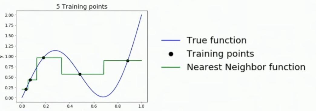
Plot showing true function (blue), training points (black), and nearest neighbor approximation (green)
This example uses only five training points, as clearly labeled in the graph’s title. The quality of our function approximation is quite poor, with the green nearest neighbor function creating a crude step-wise approximation of the smooth blue true function.
**As the number of training samples goes to infinity, nearest neighbor can represent any function, subject to technical conditions.** But as we increase the number of training samples here doubling to 10, again doubling to 20, and now going up again to 100, we can see that this one nearest neighbor class fire basically is doing a very, very good job at approximating this underlying function.
Intuitively, with enough training points covering the entire space, the nearest neighbor algorithm can achieve an arbitrarily accurate approximation of the true underlying function. So that seems to be really good news, right? **This suggests nearest neighbor could be the only learning algorithm we need.** **It can represent any function, provided we collect sufficient training data.**
**But there’s a catch here, and that catch is called the curse of dimensionality.**
### The Exponential Problem
**The curse of dimensionality demonstrates that for uniform coverage of space, the number of training points needed grows exponentially with dimension.** So the problem is that in order to get a kind of uniform coverage of the full space of the training set, we need a number of training samples which is exponential in the dimension of the underlying space.
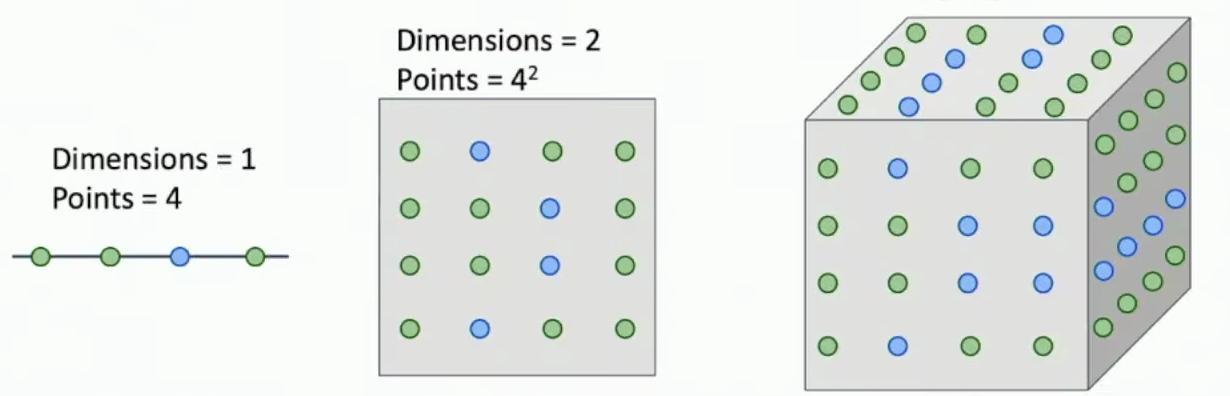
Visual progression of dimensionality from 1D to 3D
**In the one-dimensional case, we only need 4 training points to achieve uniform coverage of the space.** So in the example from the previous slide, our input space was only one dimensional. **With just four training samples, we can achieve relatively dense coverage of a one-dimensional space, as shown by the linear arrangement of points.** So then suppose here maybe we actually don’t need that many training samples to get a relatively dense coverage of a one dimensional space.
**Moving to a two-dimensional space requires 4² = 16 points to maintain similar coverage density.** Suppose we had a two dimensional space, and we wanted to achieve a similar density in our training samples over a two dimensional space. **In two dimensions, we need 4² = 16 training samples arranged in a grid pattern to maintain uniform coverage.** Now we would need, now instead of needing four examples in this example, we now would need something like four squared training samples.
**In three dimensions, we require 4³ = 64 training samples to achieve similar density coverage, as illustrated by the cubic arrangement.** And as we move to three dimensions, we would now need four to the power of three training samples to again achieve a similar density in covering our space.
We need a lot of data, it’s sure, but the internet’s really big, right? Maybe there’s enough images out there to cover the space of all visual things we might care about. And this would be very wrong to assume, right?
## Practical Limitations of K-NN on Raw Pixels
**K-Nearest Neighbor classification on raw pixels is seldom used in practice.** So for a couple of reasons, one, as we’ve seen, it’s very slow at test time. **That’s the opposite of what we want from machine learning systems.**
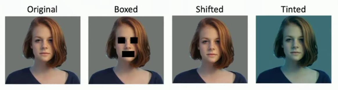
Four image variations showing original and modifications
**Distance metrics on raw pixel values are not informative or meaningful.** The other is that the other is just, it’s very hungry for data. This can be demonstrated through three image variations – boxed, shifted, and tinted – which all have the same L2 distance from the original image, despite appearing perceptually very different.
The shifted image appears very similar to the original, yet the L2 distance metric treats it as equally different as the boxed or tinted versions. So as kind of a trivial example of this, if we look at this original image on the right on the left and compute the L2 distance from the original image to each of these three perturbed images, the L2 distance is the same across all of these three pairs.
The middle, this shifted image, for example, to us appears very, very similar to this original image on the left. So you might intuitively hope that any reasonable metric of comparing image similarity should say that the original image and the shifted image are very, very similar, which is a boxed image or this tinted image should be much larger in distance.
But unfortunately, these kind of raw pixel wise L2 or L1 metrics between raw pixels of images is just not very sensitive and is not able to capture these kind of perceptual or semantically meaningful distances between images.
### A Promising Alternative: Deep Feature Vectors
So even though raw pixel raw, even though nearest neighbor classifiers on raw pixel values do not work very well, actually it turns out somewhat surprisingly that one thing that does work quite well is nearest neighbors using feature vectors computed from deep convolutional neural networks.
Here’s an example of doing nearest neighbor retrieval using not the raw pixel values, but instead using feature vectors computed for these images with a deep network. And what you can see is that now our nearest neighbors that we retrieve are quite semantically meaningful.
So here we give a picture of a train. We’re able to retrieve trains, even though they are from different viewpoints and different different angles have trained and even have trains in different positions in the image. Or if we look at this image of a baby, we can see that we’re able to retrieve other images of babies, even though they look very, even though the raw pixel values are completely different.
—
## Conclusion
Understanding nearest neighbor classification reveals a fascinating paradox in machine learning. While the algorithm offers theoretical universal approximation capabilities and intuitive interpretability, practical applications face significant challenges that limit its real-world effectiveness.
The journey from basic k-NN concepts through advanced considerations demonstrates several key insights:
**Theoretical Power vs. Practical Limitations**: Nearest neighbor algorithms can theoretically represent any function given infinite data, but the curse of dimensionality makes this practically impossible for high-dimensional problems like image recognition.
**The Critical Role of Data Validation**: Proper hyperparameter selection through techniques like cross-validation isn’t just good practice—it’s essential for honest evaluation of algorithm performance and research integrity.
**Distance Metrics Matter**: The choice between L1 and L2 distance fundamentally changes decision boundary characteristics, and raw pixel distances often fail to capture semantic similarity that humans intuitively recognize.
**Evolution Toward Deep Learning**: The limitations of k-NN on raw pixels point toward the necessity of learned feature representations, foreshadowing the deep learning revolution that would address many of these fundamental challenges.
This analysis underscores a critical principle that extends beyond nearest neighbors: **the gap between theoretical capability and practical utility often lies in the details of implementation, data requirements, and computational constraints.** While k-NN may not be the universal solution it initially appears to be, understanding its strengths and limitations provides essential foundations for appreciating more sophisticated machine learning approaches.