LLM_log #017: Scoring Color Harmony — From Two Squares to a Room
Highlights: Can you score color quality algorithmically? Not as taste — as math. This post builds a scoring system from first principles: two adjacent color squares, then triplets, then a real room with three spatial regions. We walk through every formula with brand and flag examples you already know, then prove that geometry alone can move the score by five points on an identical palette.
- Four pair scoring dimensions: contrast (WCAG luminance), harmony (hue peaks), saturation balance, temperature
- Three triplet extensions: triangle spread in hue space, role hierarchy, pairwise harmony aggregate
- Real examples: McDonald’s, Starbucks, Firefox, Japan flag, China flag — full step-by-step calculations
- Spatial scoring: boundary pixel matrix → adjacency harmony + edge contrast + figure/ground
- Geometry experiment: same three colors, three room proportions — score moves 69.6 → 74.5
- All formulas in Appendix A — post leads with examples, math follows
Tutorial Overview:
- The problem: what does “best” mean?
- Pair scoring — walking through real brands
- Triplet scoring — three colors, three roles
- Flag palettes — algorithm vs cultural power
- Spatial scoring — when geometry changes everything
- The geometry experiment
- Python implementation
- Appendix A — complete formula reference
- Appendix B — flag palette reference
1. The Problem: What Does “Best” Mean?
Start with the simplest possible version: two 50×50px squares, side by side, two random colors. Which pair is better?
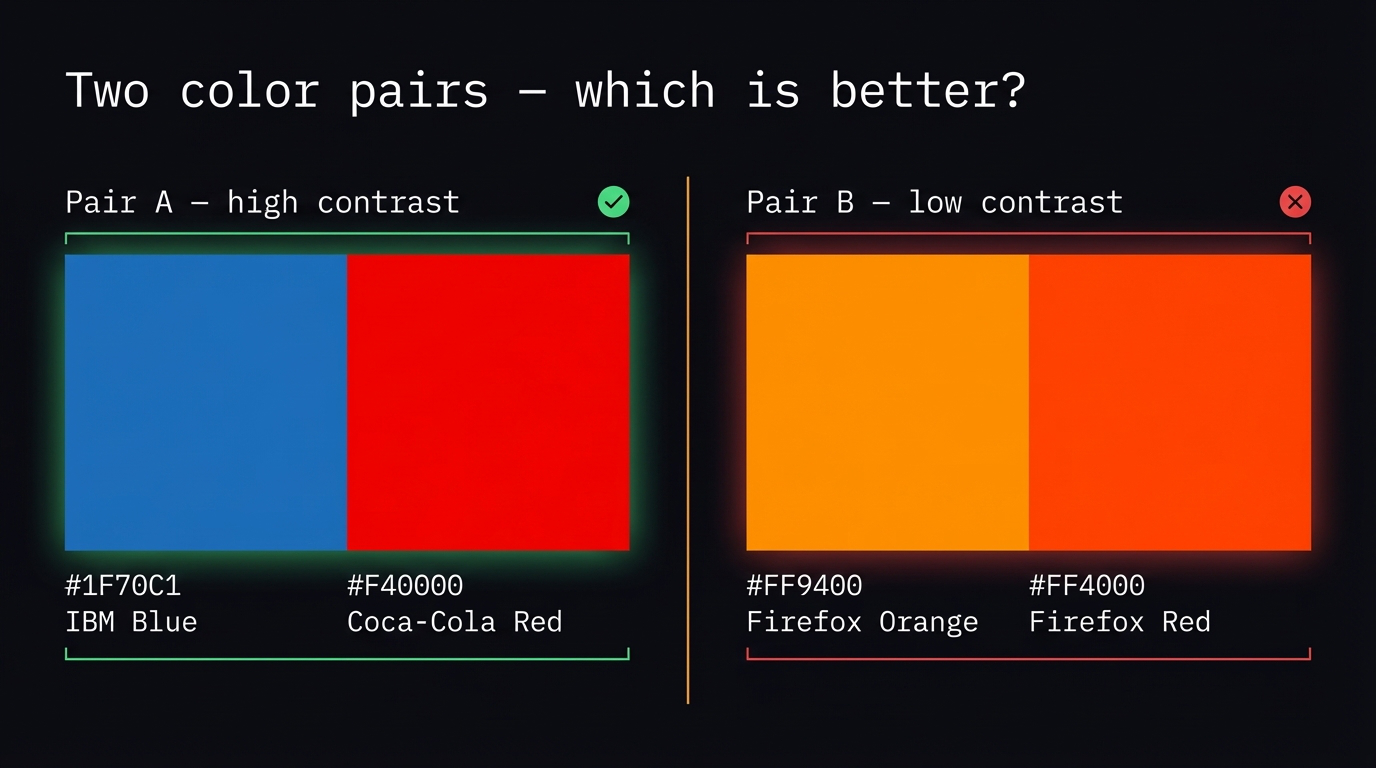
Fig 1. Two pairs — IBM blue + Coca-Cola red (left) vs Firefox orange + red-orange (right). Which is better, and why?
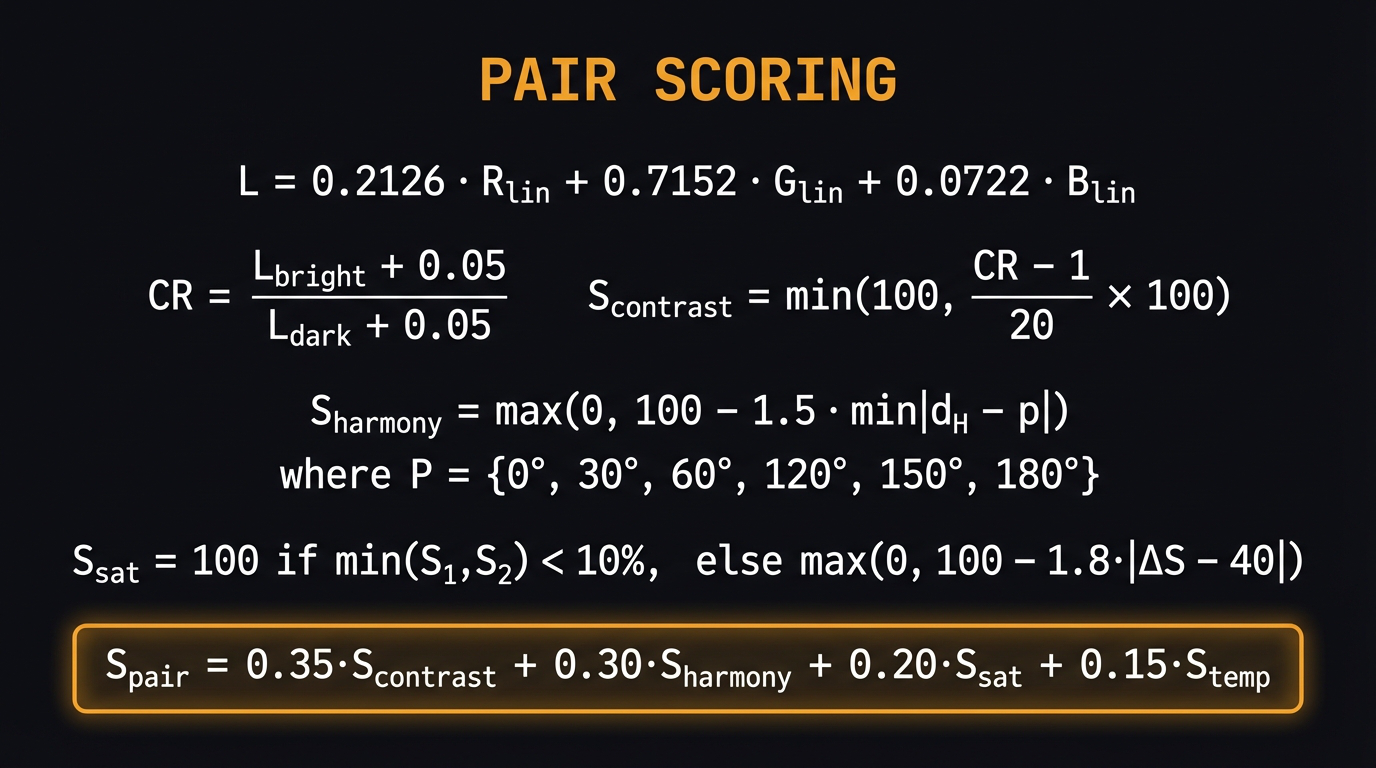
The question has no single answer — “better” is undefined. But we can decompose it. A color pair can be evaluated on four independent axes: how legible it is (contrast), how harmonically resolved it is (hue relationship), whether one color dominates the other (saturation balance), and whether the temperatures create tension (warm vs cool).
Each axis has a formula. The formulas combine into a weighted score. The weights encode what “best” means for your specific use case — UI accessibility weights contrast highest; brand identity weights harmony highest.
Key idea: We are not replacing subjective judgment. We are decomposing it into defensible, tunable components. The score is a starting point for a conversation, not a verdict.
2. Pair Scoring — Walking Through Real Brands
Instead of starting with formulas, start with examples you already know.
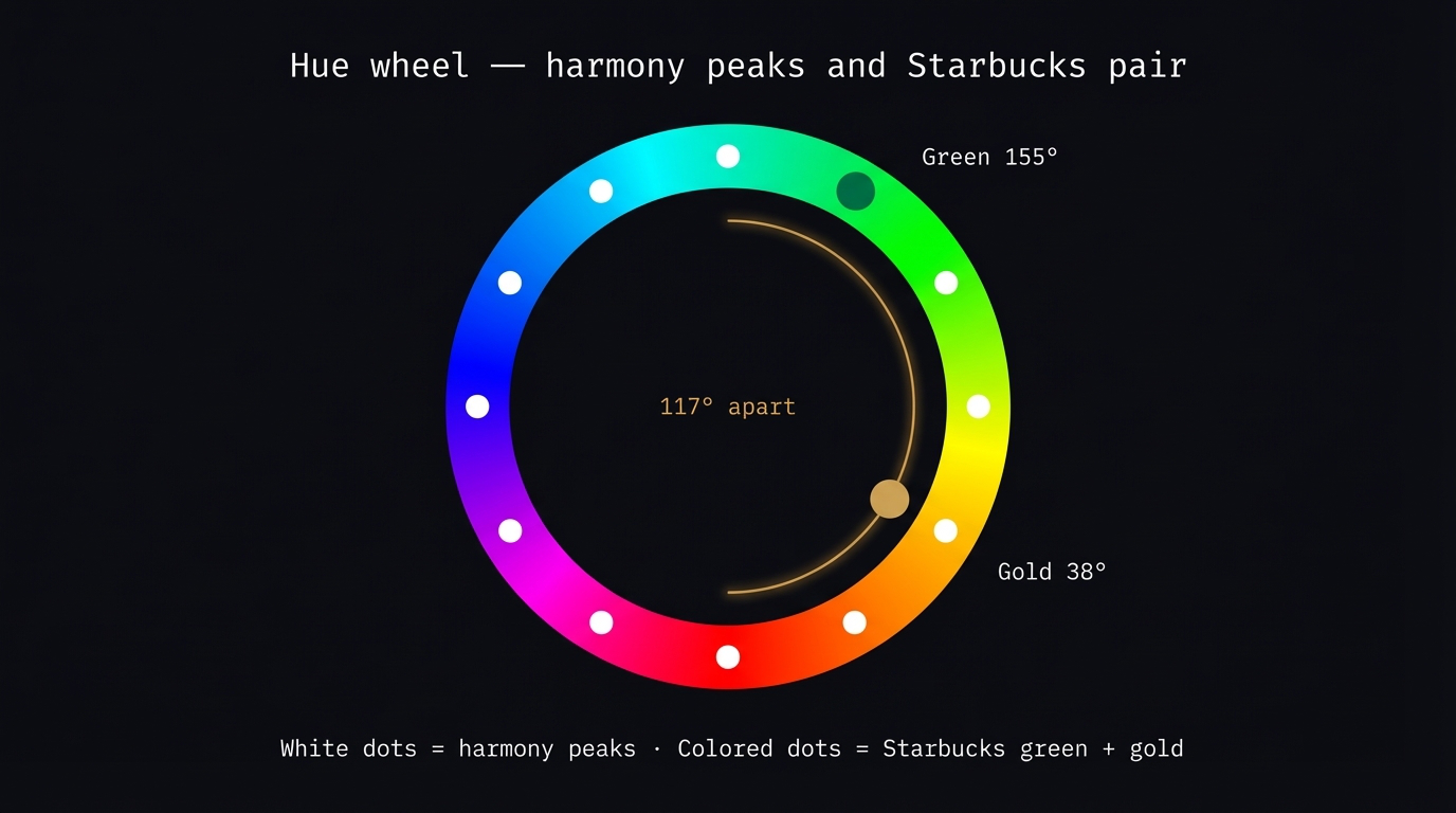
Fig 2. The hue wheel. White dots mark the six harmony peaks (0°, 30°, 60°, 120°, 150°, 180°). The colored dots show Starbucks green + gold sitting 117° apart — near the triadic peak at 120°.
2.1 Starbucks — the harmony case
Green #00704A + Gold #CBA258. These two colors sit approximately 117° apart on the hue wheel — near the triadic peak at 120°. That is the highest harmony score in the brand set.
| Step | Calculation | Result |
|---|---|---|
| Lum green | 0.2126·0 + 0.7152·0.141 + 0.0722·0.055 |
0.105 |
| Lum gold | 0.2126·0.581 + 0.7152·0.373 + 0.0722·0.109 |
0.398 |
| CR | (0.398+0.05) / (0.105+0.05) |
2.89:1 |
| S_contrast | min(100, (2.89−1)/20×100) |
9.5 |
| d_H | |155−38| = 117° closest peak = 120° |
— |
| S_harmony | max(0, 100−1.5×|117−120|) |
95.5 |
| ΔS | |100−49| = 51 → penalty 1.8×|51−40| |
80.2 |
| Temperature | cool (−1) + warm (+1) → opposite | 90 |
| S_pair | 0.35×9.5 + 0.30×95.5 + 0.20×80.2 + 0.15×90 |
≈ 62 |
Starbucks diagnosis: Near-triadic hue angle, warm+cool dynamic, good saturation separation. Low lightness contrast pulls the score down — CR 2.89:1 is below WCAG AA. This is a harmony-optimized pair at some cost to legibility. Exactly right for a premium lifestyle brand that does not need to scream.
2.2 Coca-Cola — the neutral bonus case
Red #F40000 + Black #000000. Black has S = 0% — it is perceptually neutral. The algorithm applies a neutral bonus: when either color has S < 10%, the saturation balance penalty is waived entirely, because a vivid + neutral pairing always has implicit role hierarchy.
| Step | Calculation | Result |
|---|---|---|
| CR | (0.216+0.05) / (0.000+0.05) |
5.32:1 |
| S_contrast | min(100, (5.32−1)/20×100) |
21.6 |
| S_sat | black S=0% → neutral bonus applied | 100 |
| Temperature | red warm (+1), black neutral (0) | 65 |
| S_pair | 0.35×21.6 + 0.30×65 + 0.20×100 + 0.15×65 |
≈ 67 |
Without the neutral bonus, Coca-Cola would score ≈35 on saturation balance (extreme ΔS = 100 vs 0). With it, the vivid + neutral formula is correctly rewarded. IBM (blue + white), Japan (red + white), Switzerland (red + white) all benefit from the same rule.
2.3 Firefox — the bad example
Orange #FF9400 + Red-orange #FF4000. Only 20° apart, both S = 100%, CR 1.66:1. Every scoring dimension fails simultaneously.
| Dimension | Value | Score |
|---|---|---|
| Contrast | CR 1.66:1 | 3.3 |
| Harmony | d_H=20°, peak=30° → 100−1.5×10 | 85 |
| Sat balance | ΔS=0 → penalty 1.8×40 | 28 |
| Temperature | both warm | 40 |
| S_pair | 0.35×3.3 + 0.30×85 + 0.20×28 + 0.15×40 |
≈ 38 |
Firefox diagnosis: Harmony is the only dimension above average — the 20° analogous gap lands near a known peak. But a pair where neither color can rest against the other has no hierarchy, no contrast, no temperature tension. The cleanest bad example in the set.
2.4 Full brand palette scores
| Brand | Colors | Contrast | Harmony | Sat bal | Temp | Total |
|---|---|---|---|---|---|---|
| Coca-Cola | #F40000 + #000000 | 22 | 65 | 100 | 65 | 67 |
| IBM | #1F70C1 + #FFFFFF | 28 | 65 | 100 | 65 | 63 |
| Starbucks | #00704A + #CBA258 | 10 | 96 | 80 | 90 | 62 |
| McDonald’s | #FFC72C + #DA291C + #27251F | — triplet — | 62 | |||
| Burger King | #F5AA1C + #C8102E + #3D1152 | — triplet — | 63 | |||
| Pepsi | #004B93 + #ED1C24 | 14 | 77 | 28 | 90 | 51 |
| Cadbury | #3D1152 + #A67C52 | 9 | 71 | 58 | 40 | 44 |
| Firefox | #FF9400 + #FF4000 | 3 | 85 | 28 | 40 | 38 |
3. Triplet Scoring — Three Colors, Three Roles
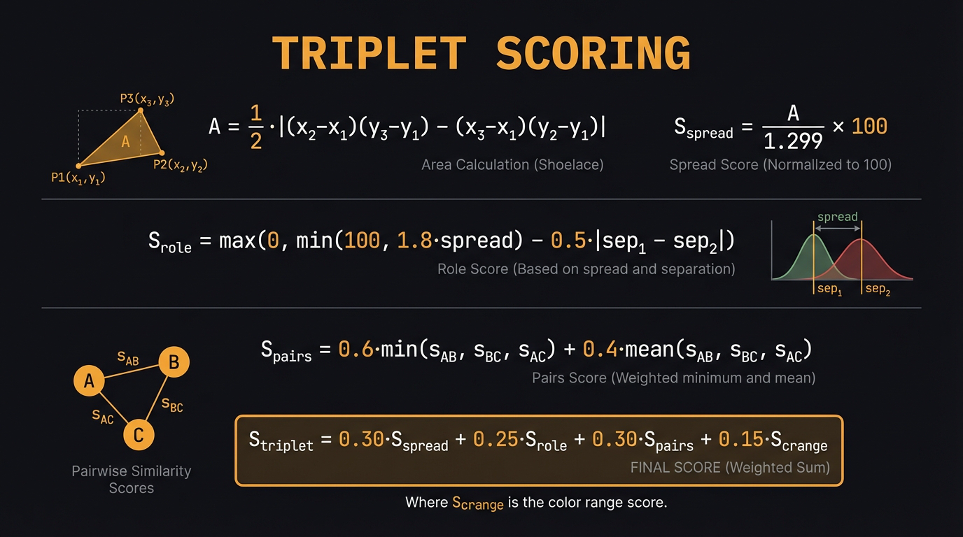
Moving from 2 to 3 colors changes the problem fundamentally. Two colors are symmetric — neither is obviously dominant. Three colors almost always fall into a hierarchy: dominant, secondary, accent. That hierarchy is half the scoring job.
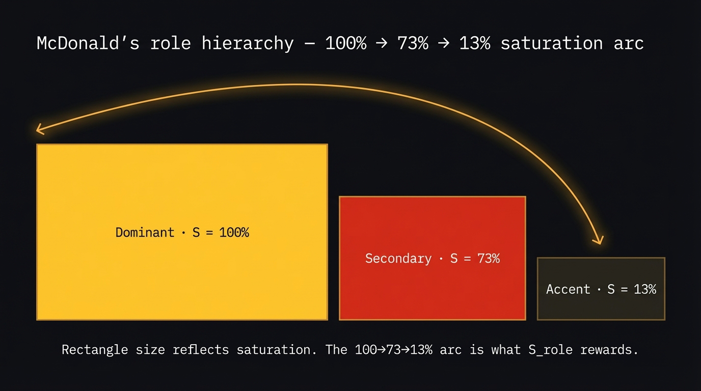
Fig 3. McDonald’s role hierarchy. Rectangle size reflects saturation — yellow (S=100%) dominates, red (S=73%) supports, near-black (S=13%) anchors. The 100→73→13% arc is what S_role rewards.
Three scoring dimensions replace the pair formula:
- Triangle spread — area of the triangle formed by projecting hues onto the unit circle. Maximum = equilateral = triadic.
- Role hierarchy — are the saturation steps clearly separated? Rewards spread, penalizes uneven gaps.
- Pairwise harmony — score all three pairs, weight by the weakest. One bad pair kills a triplet.
3.1 McDonald’s — full triplet walkthrough
Yellow #FFC72C (H=43°) + Red #DA291C (H=4°) + Near-black #27251F (H=40°).
Step 1 — Triangle spread. Project each hue onto the unit circle and compute the triangle area.
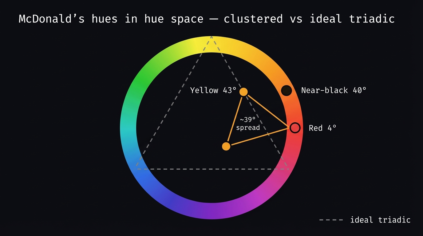
Fig 4. McDonald’s hues in hue space. All three cluster between 4°–43° — a tiny triangle. Dashed line shows the ideal equilateral triadic for comparison. Low spread is intentional: warm monochromatic + near-neutral, not triadic.
| Color | H | x = cos(H) | y = sin(H) |
|---|---|---|---|
| Yellow | 43° | 0.731 | 0.682 |
| Red | 4° | 0.997 | 0.070 |
| Near-black | 40° | 0.766 | 0.643 |
$$A = \frac{1}{2}|(0.997-0.731)(0.643-0.682) – (0.766-0.731)(0.070-0.682)| = 0.006$$
$$S_{spread} = \frac{0.006}{1.299} \times 100 = 0.5$$
Why so low? All three hues cluster between 4°–43° — only 39° of total spread. McDonald’s is a warm monochromatic + near-neutral structure, not a triadic palette. The spread score penalizes this, but the role hierarchy rescues it.
Step 2 — Role hierarchy. Sort by saturation: Yellow S=100% → Red S=73% → Near-black S=13%.
$$S_{role} = \min(100,\; 1.8 \times 87) – 0.5 \times |27-60| = 100 – 16.5 = 83.5$$
Step 3 — Pairwise harmony.
| Pair | d_H | Closest peak | S_harmony |
|---|---|---|---|
| Yellow – Red | 39° | 30° | 86.5 |
| Red – Near-black | 36° | 30° | 91.0 |
| Yellow – Near-black | 3° | 0° | 95.5 |
$$S_{pairs} = 0.6 \times 86.5 + 0.4 \times \frac{86.5+91.0+95.5}{3} = 88.3$$
Step 4 — Contrast range. \(S_{crange} = \min(100,\; (0.582-0.003) \times 200) = 100\)
McDonald’s diagnosis: Strong role hierarchy (100→73→13% saturation arc) and near-analogous pairwise harmony. Near-zero spread because all hues are warm. This proves warm-monochromatic + neutral can score competitively against triadic. For brand/packaging work, reduce spread weight and increase role weight.
4. Flag Palettes — Algorithm vs Cultural Power
National flags are constrained design problems: recognizable at distance, on any background, at any size. Let’s run three through the scorer.
4.1 Japan — near-optimal pair
Crimson #BC002D + White #FFFFFF. White S = 0% — neutral bonus applies. CR 6.86:1. Total ≈ 59.
4.2 Sweden — near-complementary pair
Blue #005293 (H=207°) + Gold #FFCD00 (H=48°). d_H = 159°, S_harmony = 68.5. Cool+warm → 90. Total ≈ 53.
Sweden + Ukraine both use
#FFCD00(Pantone 116C) as their yellow. Their blues differ slightly (207° vs 211°) but scores are nearly identical. The colors may share the same heraldic origin.
4.3 China — iconic but algorithmically weak
Red #DE2910 + Gold #FFDE00. Both warm, 45° apart. Total ≈ 44.
The most important example in this post. Score 44/100 for one of the world’s most recognizable flags. The algorithm measures harmony — not cultural power. Red + yellow carry weight no equation captures. This is the strongest argument for treating the score as one input among several, not as a verdict.
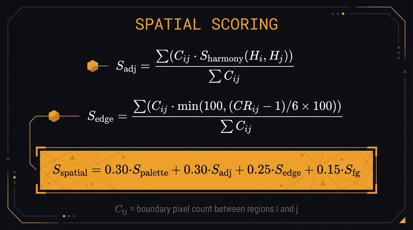
5. Spatial Scoring — When Geometry Changes Everything
The pair and triplet scorers treat colors as abstract vectors — no geometry, no area, no adjacency. Two rooms with identical color triplets but different proportions receive identical scores. That is wrong.
We use the minimal meaningful room: three regions — wall, sofa, floor. Three colors, three shared boundaries.
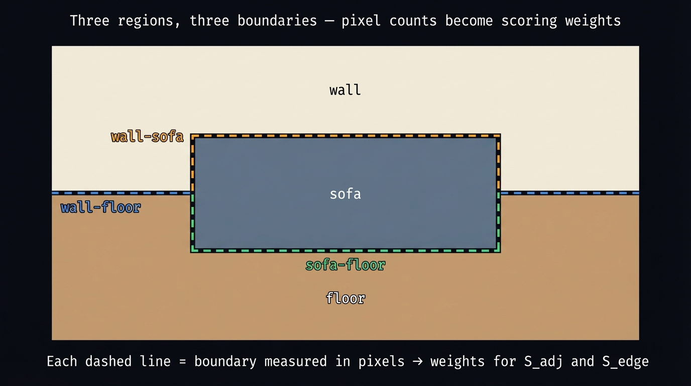
Fig 5. Three regions, three boundaries. Each dashed line is a boundary measured in pixels. The pixel counts become the weights in S_adj and S_edge.
| Component | Geometry? | What it captures |
|---|---|---|
S_palette |
Color only | Full triplet score |
S_figure_ground |
Color only | Sofa vs wall luminance separation |
S_adj_harmony |
Geometry | Harmony weighted by boundary pixel count |
S_edge_contrast |
Geometry | CR at boundaries, weighted by boundary length |
5.1 The boundary matrix
for axis in [0, 1]:           # horizontal + vertical neighbors
    a = label_map[:-1]
    b = label_map[1:]
    mask = a != b
    for i, j in zip(a[mask], b[mask]):
        C[i,j] += 1;  C[j,i] += 1
No graph library. One pass over a NumPy array. For k=3 regions, three non-zero entries.
5.2 Palette 1: Greige + Slate + Oak — total 55.0
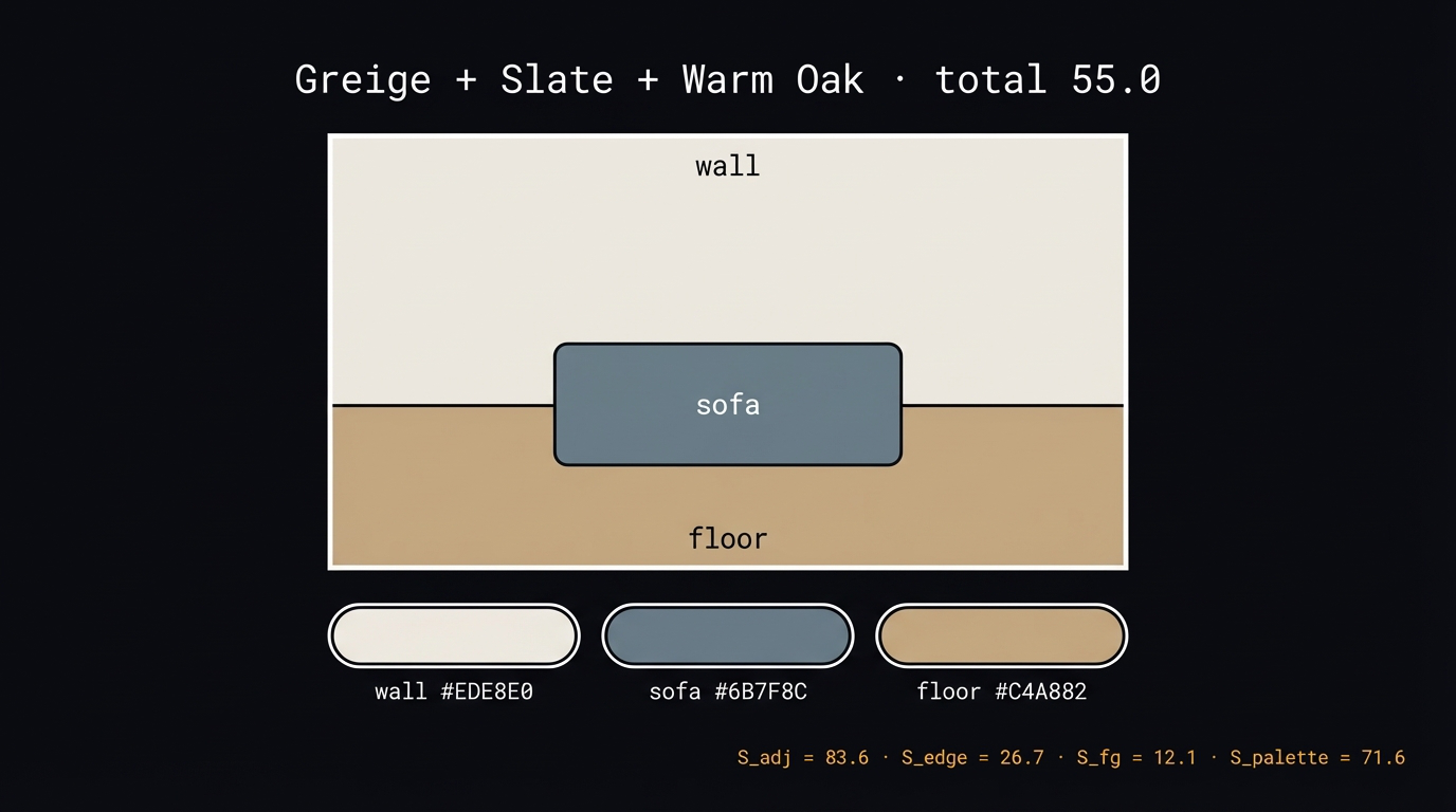
Fig 6. Greige + Slate + Warm Oak. Wall #EDE8E0, sofa #6B7F8C, floor #C4A882.
Wall–sofa CR 3.42:1, wall–floor CR 1.86:1, sofa–floor CR 1.84:1. S_adj = 83.6, S_edge = 26.7, S_fg = 12.1, S_palette = 71.6.
$$S_{spatial} = 0.30 \times 71.6 + 0.30 \times 83.6 + 0.25 \times 26.7 + 0.15 \times 12.1 = \mathbf{55.0}$$
Tonal room diagnosis: The slate sofa barely separates from the warm oak floor (CR 1.84:1). The algorithm identifies this as weak spatial definition. A real designer would call it restrained — valid domain disagreement, and a direct argument for reducing the edge contrast weight in interior design contexts.
5.3 Palette 2: Chalk + Charcoal + Stone — total 73.1
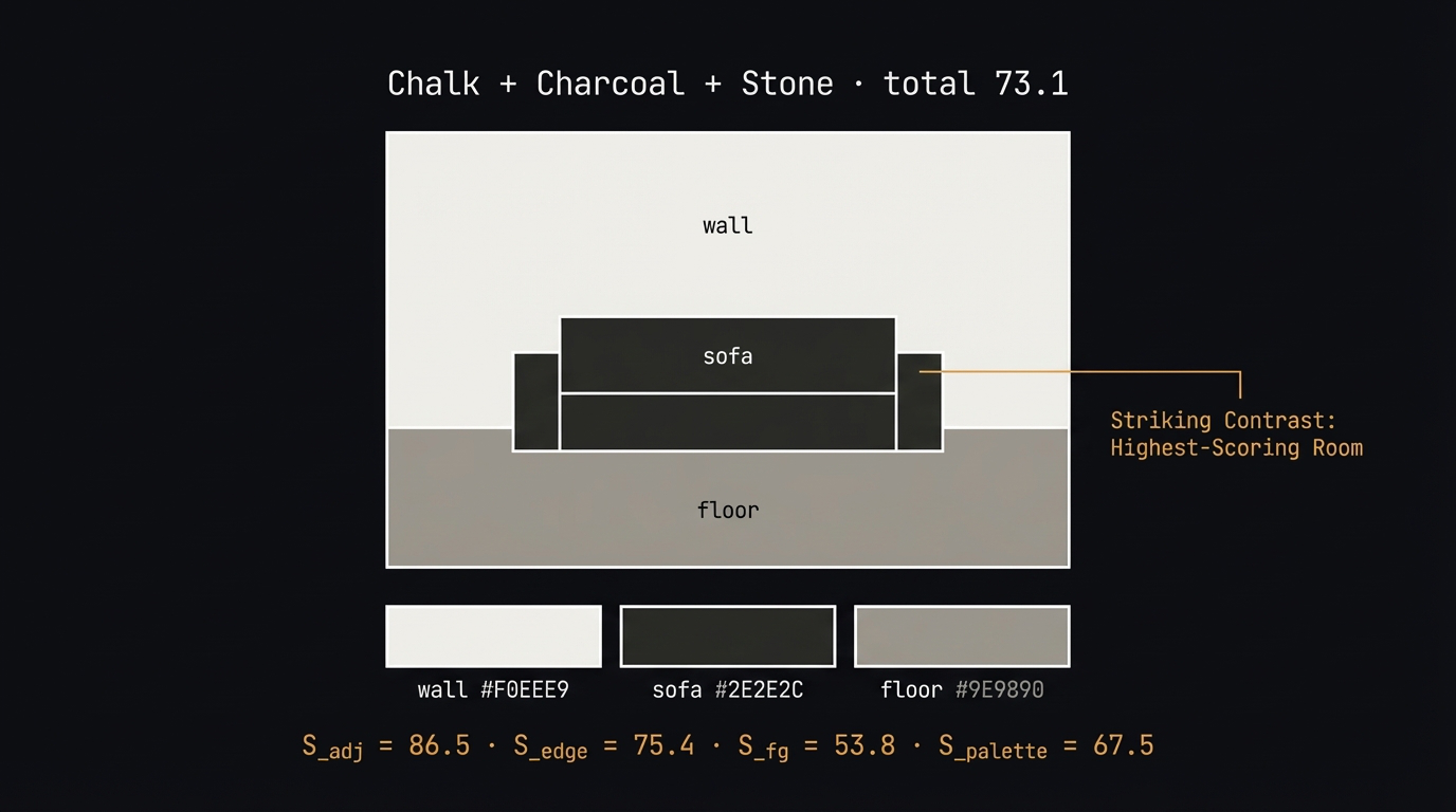
Fig 7. Chalk + Charcoal + Stone. Wall #F0EEE9, sofa #2E2E2C, floor #9E9890.
Wall–sofa CR 11.77:1 (dominant pair), sofa–floor CR 4.77:1. S_adj = 86.5, S_edge = 75.4, S_fg = 53.8, S_palette = 67.5.
$$S_{spatial} = 0.30 \times 67.5 + 0.30 \times 86.5 + 0.25 \times 75.4 + 0.15 \times 53.8 = \mathbf{73.1}$$
High contrast diagnosis: The charcoal sofa against the chalk wall (CR 11.77:1) dominates both edge and figure/ground scores. The 700px wall–sofa boundary carries the most weight precisely because it is the high-contrast pair. This is “let the dominant contrast define the room” expressed as a number.
5.4 Palette 3: Ivory + Terracotta + Dark Wood — total 60.5
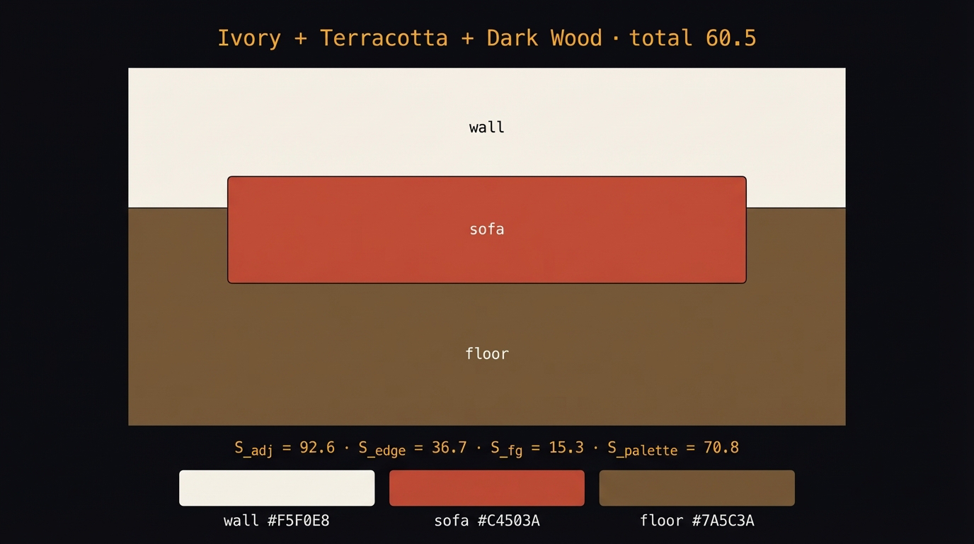
Fig 8. Ivory + Terracotta + Dark Wood. Wall #F5F0E8, sofa #C4503A, floor #7A5C3A.
Sofa–floor CR = 1.33:1 — terracotta sofa and dark wood floor are both mid-dark warm tones. S_adj = 92.6, S_edge = 36.7, S_fg = 15.3, S_palette = 70.8.
$$S_{spatial} = 0.30 \times 70.8 + 0.30 \times 92.6 + 0.25 \times 36.7 + 0.15 \times 15.3 = \mathbf{60.5}$$
Bold contrast diagnosis: Best pairwise harmony in the set — all three pairs land near the analogous peak at 30°. But sofa–floor collapses spatially. The fix is not a new color — it is adjusting the lightness of the floor to create separation.
6. The Geometry Experiment
Fixed palette: Chalk #F0EEE9 · Charcoal #2E2E2C · Stone #9E9890. Same three colors, three room proportions.
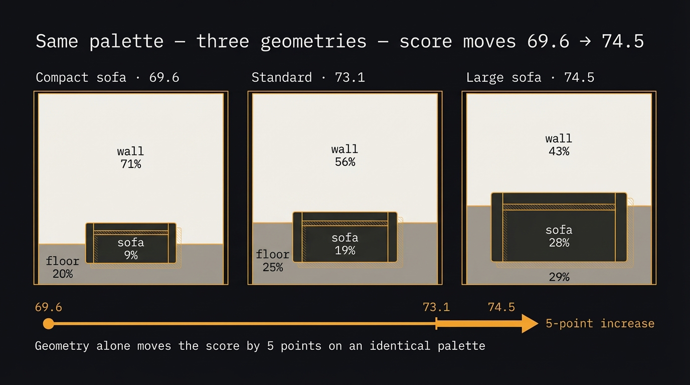
Fig 9. Same palette, three geometries. Score moves 69.6 → 74.5 — a 5-point swing on an identical palette.
| Variant | Wall % | Floor % | Sofa % | S_edge | S_adj | Total |
|---|---|---|---|---|---|---|
| Compact sofa | 71% | 20% | 9% | 62.1 | 85.9 | 69.6 |
| Standard | 56% | 25% | 19% | 75.4 | 86.5 | 73.1 |
| Large sofa | 43% | 29% | 28% | 80.1 | 87.1 | 74.5 |
S_palette = 67.5 and S_fg = 53.8 are identical across all three — geometry-independent, confirmed. Only S_edge and S_adj change. The wall–sofa boundary grows from 472px to 810px as the sofa expands. Since wall–sofa is the high-contrast pair (CR 11.77:1), more of that boundary directly raises S_edge. A 5-point score swing from geometry alone on an identical palette.
7. Python Implementation
Both files are Colab-ready, no argparse.
# Core pipeline — spatial scoring
canvas, label_map = rasterize(colors)      # colors dict → H×W pixel array
C = boundary_counts(label_map)             # k×k boundary matrix, one pixel pass

sp  = s_palette(colors)                    # geometry-independent triplet score
sa  = s_adj_harmony(C, colors)             # boundary-weighted harmony
se  = s_edge_contrast(C, colors)           # boundary-weighted CR score
sfg = s_figure_ground(colors)              # sofa vs wall

total = 0.30*sp + 0.30*sa + 0.25*se + 0.15*sfg
Files: room_3region.py — three palettes, full score breakdown. geometry_effect.py — fixed palette, three geometries, boundary chart. Both on GitHub.
Appendix A — Complete Formula Reference
Appendix B — Flag Palette Reference
| Flag | Colors | Score | Key observation |
|---|---|---|---|
| Japan | #BC002D + #FFFFFF | 59 | Warm vivid + neutral. Near-optimal formula. |
| Switzerland | #FF0000 + #FFFFFF | 61 | Same formula as Japan. Vivid + neutral. |
| Somalia | #4189DD + #FFFFFF | 67 | Cool + neutral. Calm but low energy. |
| Ireland | #169B62 + #FFFFFF + #FF7900 | 71 | ~150° spread. Split-comp with white pivot. |
| Colombia | #FCD116 + #003087 + #CE1126 | 65 | Yellow 50% of flag. 60-30-10 in practice. |
| France | #000091 + #FFFFFF + #E1000F | 57 | Textbook tricolor. White as pivot. |
| Germany | #000000 + #DD0000 + #FFCC00 | 53 | Warm mono + neutral anchor. High contrast range. |
| Sweden | #005293 + #FFCD00 | 53 | ~160° apart. Deep cool + warm gold. |
| Jamaica | #FED100 + #009B3A + #000000 | 61 | No red/white/blue. Strong role arc. |
| Ukraine | #0057B7 + #FFCD00 | 49 | Same yellow as Sweden. Shared heraldic origin. |
| Bangladesh | #F42A41 + #006A4E | 50 | ~160° near split-comp. Warm + cool. |
| China | #DE2910 + #FFDE00 | 44 | Both warm ~45° apart. Iconic but scores low. |