LLM_log #016: RGB is for Screens. Lab is for Humans — Color Scoring for Living Room Images
Highlights:
Every computer vision pipeline that touches color starts with the same mistake: using RGB. RGB is built for screens, not for human perception. In this post we build a complete color scoring system for living room images — from the right color space (Lab), through palette extraction (K-means), to a two-color harmony scorer tested on 10 global brand palettes. We discover why luxury brands deliberately score low, and what that means for your model. This is Post 01 of 7 in the Color in Living Rooms 101 series.
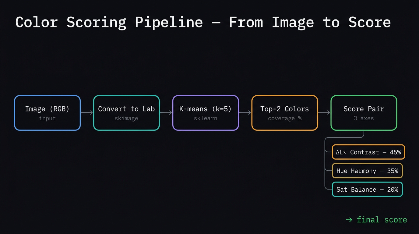
The complete color scoring pipeline — from raw image through Lab conversion, K-means palette extraction, to the three-axis scoring system.
Tutorial Overview:
- The fundamental lie RGB tells you
- The Lab color space and ΔE
- Why green dominates — the biology
- The three dimensions of every color
- How K-means works — the magnet intuition
- From one color to two
- The two-color scoring algorithm
- What the scorer reveals — 8 pairs
- Color hierarchy — what the eye reads first
- Color and psychology — the two layers
- 10 global brands — scored
- The luxury cluster — why it exists
- Code appendix
1. The fundamental lie RGB tells you
Open any photo editing tool and you have RGB — three numbers, 0–255, for red, green, blue. Seems logical. The problem is that RGB is built for screens, not for humans.
Equal numeric steps in RGB are not equal visual changes.
| Step | Blue channel (+50 each) | Green channel (+50 each) |
|---|---|---|
| 1 | (0, 0, 80) |
(0, 80, 0) |
| 2 | (0, 0, 130) |
(0, 130, 0) |
| 3 | (0, 0, 180) |
(0, 180, 0) |
| 4 | (0, 0, 230) |
(0, 230, 0) |
Same math. Completely different visual experience. The green row feels dramatic. The blue row barely moves.
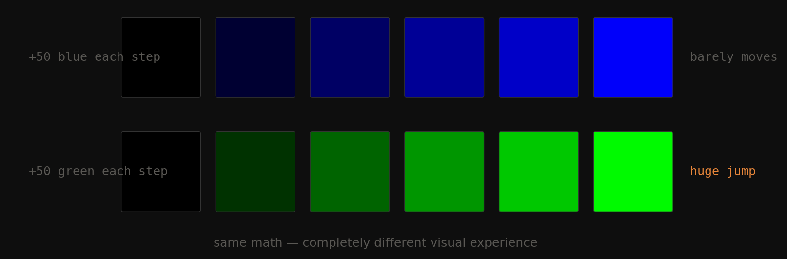
Fig 1. Equal +50 steps across the blue channel (top) vs the green channel (bottom). Same arithmetic — completely different visual experience.
Why? Human vision is not linear. We have three types of cone cells and they don’t respond equally across the spectrum. We’re roughly 3× more sensitive to green than blue. RGB ignores this completely.
2. The Lab color space and ΔE
Lab was designed by the CIE (the international lighting authority) to match human perception. Three channels:
| Channel | Name | Range | What it means |
|---|---|---|---|
| L* | Lightness | 0 → 100 | 0 = absolute black, 100 = absolute white |
| a* | Green ↔ Red | −128 → +127 | negative = green, positive = red |
| b* | Blue ↔ Yellow | −128 → +127 | negative = blue, positive = yellow |
Built around opponent color theory — how your actual cone cells encode color signals. Your brain doesn’t measure R, G, B separately. It measures light-vs-dark, red-vs-green, and blue-vs-yellow. That’s exactly what \(L^*, a^*, b^*\) are. The b* axis is your warm/cool temperature signal: negative = cool (blue), positive = warm (yellow/amber).
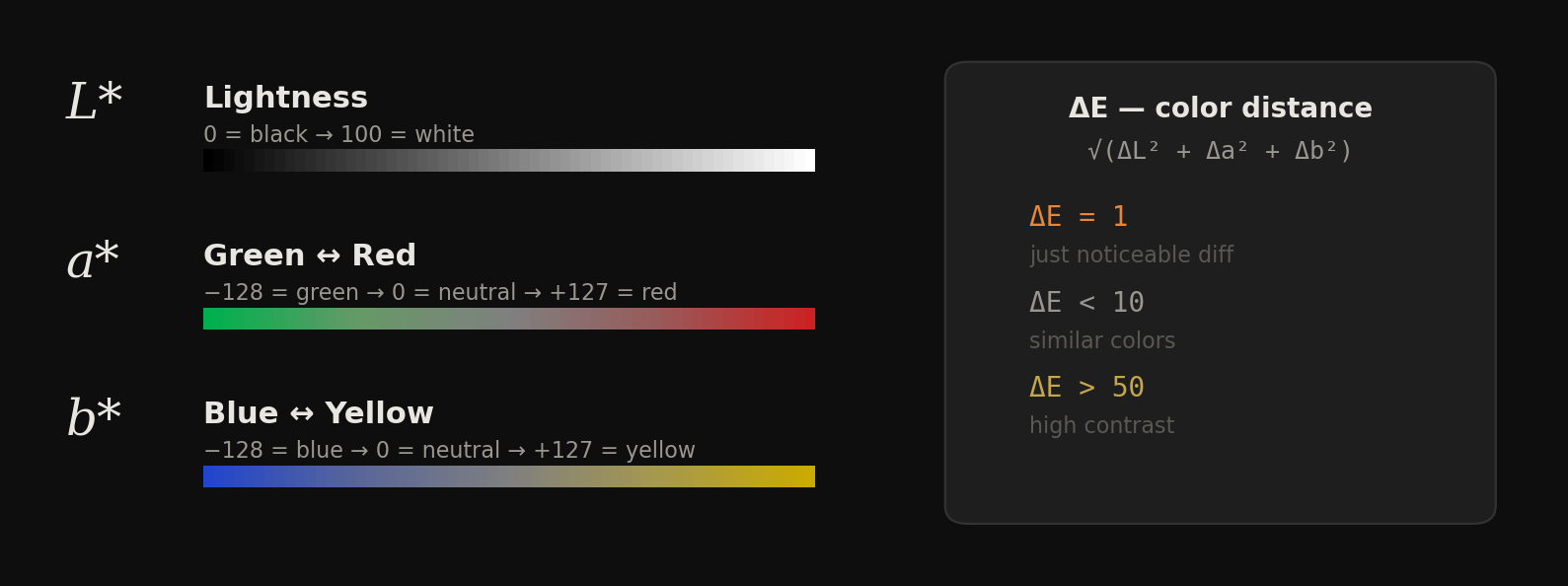
Fig 2. The three Lab axes visualized. L* goes black to white. a* goes green to red. b* goes blue to yellow. The ΔE formula gives perceptual distance in this space.
The payoff: ΔE (Delta E)
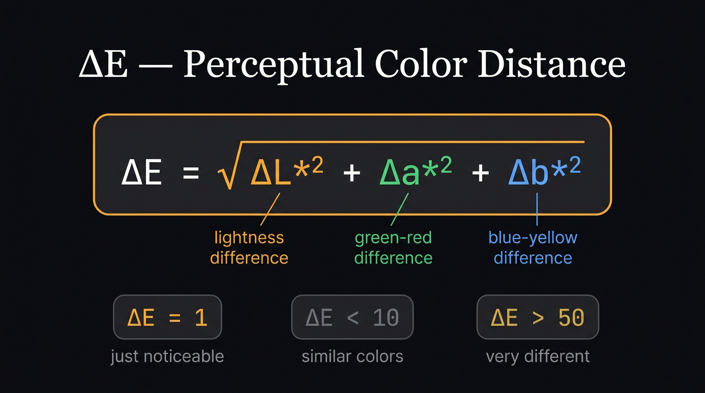
ΔE — the perceptual distance formula. One number that tells you how different two colors look to a human.
$$\Delta E = \sqrt{\Delta L^{*2} + \Delta a^{*2} + \Delta b^{*2}}$$
A single number: the perceptual distance between two colors.
| ΔE | Meaning |
|---|---|
| 1 | Just noticeable difference (JND) — smallest a human can see |
| < 10 | Similar colors |
| > 50 | High contrast, very different |
In RGB you have no equivalent. A numeric distance of 50 in RGB could be a tiny visual change or an enormous one depending on which channel and which range.
Key idea: RGB is a coordinate system for pixels. Lab is a coordinate system for human vision. Use the wrong one and every downstream calculation — palette extraction, harmony scoring, contrast measurement — is built on a lie.
3. Why green dominates — the biology
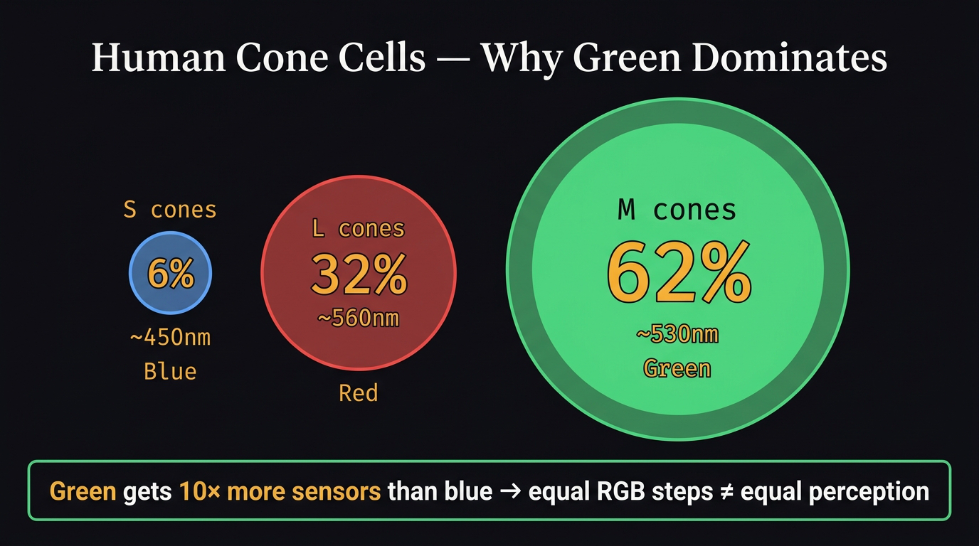
Cone cell distribution — circle sizes proportional to population. Green dominates with 62% of all cones.
Your eye has three types of cone cells: S (short), M (medium), L (long wavelength). The critical numbers:
| Cone | Color | % of all cones | Peaks at |
|---|---|---|---|
| S | Blue | 6% | ~450nm |
| L | Red | 32% | ~560nm |
| M | Green | 62% | ~530nm |
62% of your cones are M-type and they peak at green-yellow. And L cones (red-sensitive) also have heavy overlap in that same zone. So green gets double coverage — both M and L cones fire together for it. Blue only gets the 6% S cones. This is why equal steps in green feel huge and equal steps in blue feel tiny.
The practical consequence: Green is the cheapest way to create visual interest in a room. A single plant pulls attention disproportionately. Green also reads as safe and natural at the biological level — it signals food and water nearby. No other color combines that physical dominance with psychological safety.
4. The three dimensions of every color
Every color has exactly three independent properties simultaneously. Confuse them and everything downstream breaks.
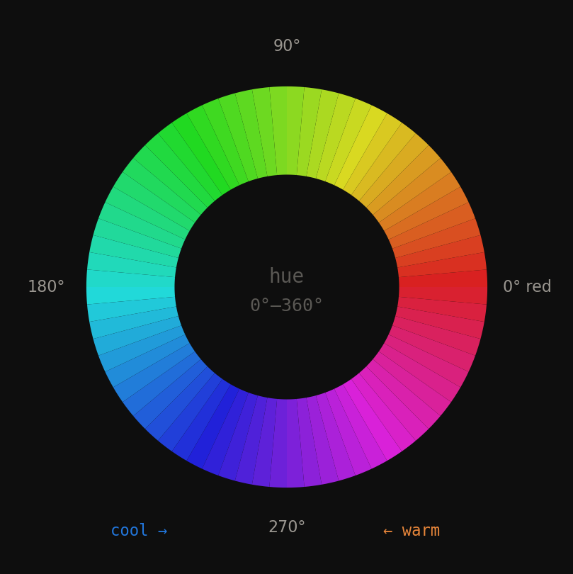
Fig 3. Hue is just an angle on the color wheel — 0° to 360°. Warm hues (red–yellow) occupy 0°–180°. Cool hues (blue–green) occupy 180°–360°.
Hue is the angle on the color wheel. Just a number from 0° to 360°. Red = 0°, yellow = 90°, green = 150°, blue = 240°. When a designer says two colors “clash” they usually mean they’re at an awkward angle — not 0° (same family), not 60° (cohesive analogous), not 180° (intentional complementary).
Saturation is how much color is in the color. Same hue angle, just drained toward grey. A fully saturated red is a traffic light. 20% saturation red is a dusty rose. The critical insight: saturation 0% is always grey — regardless of hue.
Lightness is the brightness dial. Same red, same saturation — just how much light. A high-lightness red is blush pink. A low-lightness red is burgundy. Still 0° hue.
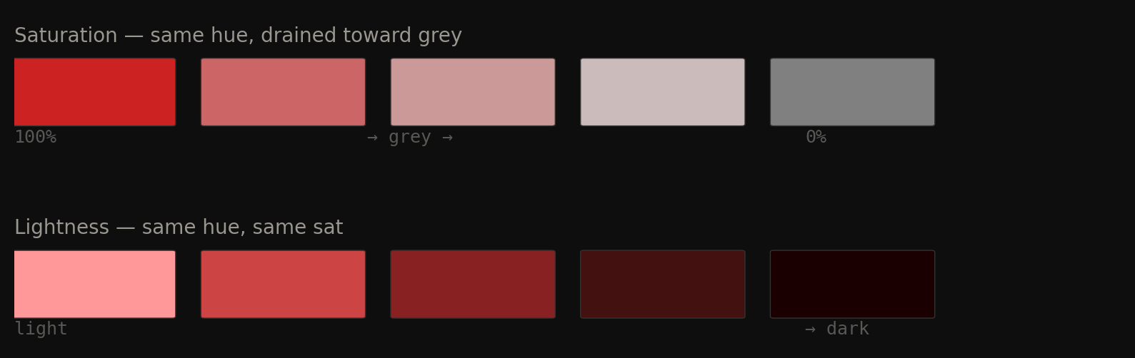
Fig 4. Saturation drains color toward grey (left). Lightness adjusts brightness (right). Both are completely independent of hue angle.
Hue distance — how designers measure relationships
| Angle apart | Relationship | Feeling |
|---|---|---|
| 0°–30° | Monochromatic | Same family, very cohesive |
| 30°–60° | Analogous | Related, harmonious |
| 150°–210° | Complementary | Maximum contrast, maximum energy |
| Everything else | Unclassified | Tension, clash, or just awkward |
Real room names are mostly just saturation levels
Linen, terracotta, clay, burnt orange, sage, forest green — most of these are not different hue families. Several are the same orange-red hue at different saturation levels. When interior designers say “muted palette” they almost always mean low saturation, not different hues.
| Room name | Hue | Saturation | Lightness |
|---|---|---|---|
| Linen / plaster | orange-red | 8% | 82% |
| Sand / terracotta | orange-red | 35% | 72% |
| Clay / brick | orange-red | 55% | 55% |
| Burnt orange | orange-red | 75% | 45% |
| Sage | green | 25% | 55% |
| Forest / emerald | green | 70% | 30% |
Three lines to lock it in:
- Hue = which color family. The angle. Red, green, blue, orange.
- Saturation = how much of that color. Full = vivid. Zero = grey.
- Lightness = how much light. High = pale/bright. Low = deep/dark.
5. How K-means works — the magnet intuition
K-means answers this question: given thousands of pixels, what are the K most representative colors?
Imagine every pixel in the image as a physical dot floating in 3D space. Its coordinates are its color (\(L^*, a^*, b^*\)). Similar colors cluster close together. You want to find the natural cluster centers.
The algorithm — 4 steps, repeating
- Place K random magnets anywhere in the space (random starting centroids)
- Every pixel snaps to its nearest magnet — nearest by Euclidean distance \(\sqrt{\Delta L^{*2} + \Delta a^{*2} + \Delta b^{*2}}\)
- Each magnet slides to the average position of all pixels attached to it
- Repeat steps 2–3 until the magnets stop moving
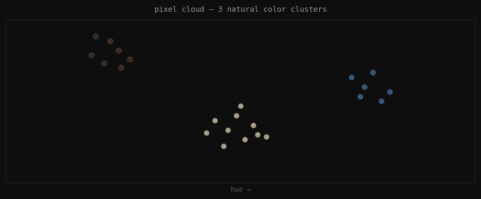
Fig 5. Start: every pixel as a dot in 3D color space. Three natural clusters visible — beige, dark brown, blue-grey. Goal: find the center of each cluster.
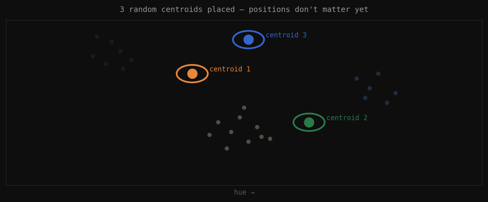
Fig 6. Step 1: place K=3 random centroids anywhere in the space. Starting position doesn’t matter.
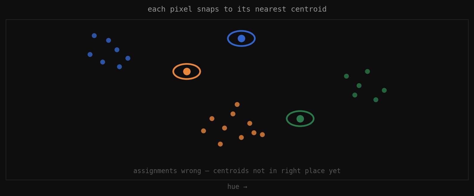
Fig 7. Step 2: every pixel snaps to its nearest centroid. Assignments are probably wrong — centroids aren’t in position yet.
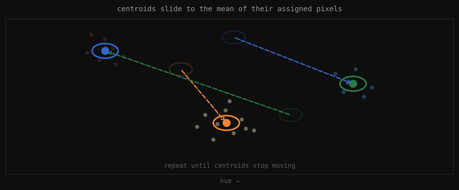
Fig 8. Step 3: each centroid slides to the mean position of all pixels attached to it. Repeat until convergence.
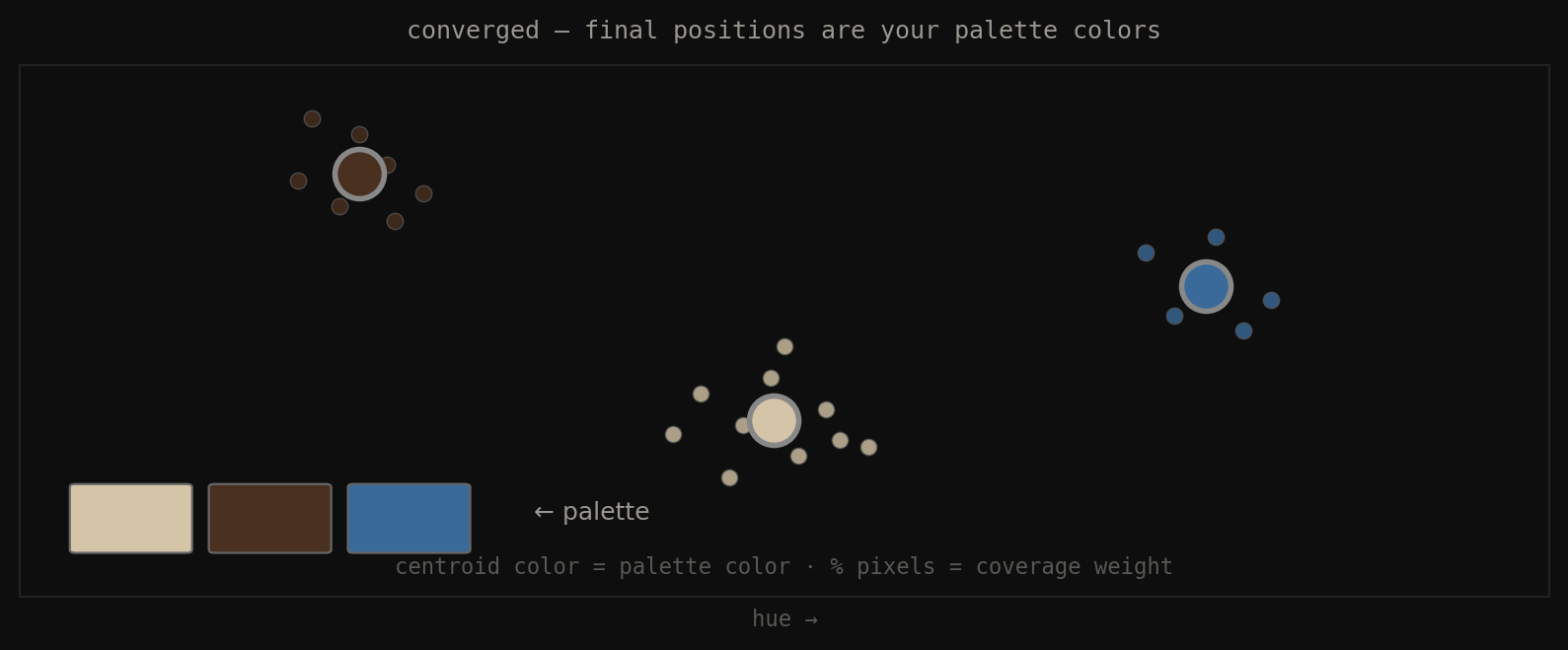
Fig 9. Converged: centroid color = palette color. Fraction of pixels per cluster = coverage weight. This weight feeds your 60-30-10 analysis.
Why the color space matters critically
The same algorithm in two different spaces gives completely different results. “Nearest” in RGB is numeric closeness — meaningless to human perception. “Nearest” in Lab is \(\Delta E\) — perceptual closeness. A bright green and a bright yellow-green have similar R+G values in RGB, so K-means groups them together. In Lab their \(\Delta E\) is large — they look clearly different to a human — so K-means correctly separates them.
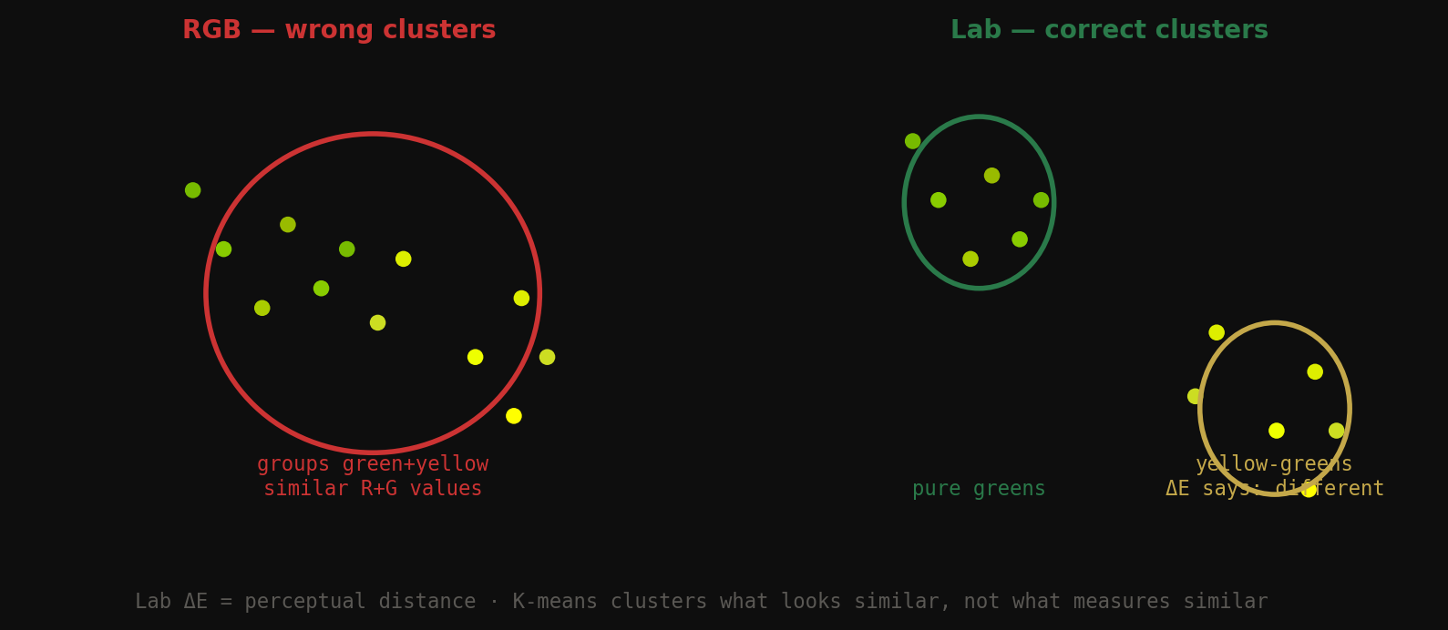
Fig 10. RGB K-means groups green + yellow-green together (similar channel values). Lab K-means correctly separates them (\(\Delta E\) is large). Same code — one line changes.
RGB K-means: "nearest" = numerically close      → wrong clusters
Lab K-means: "nearest" = perceptually close (ΔE) → correct clusters
from skimage.color import rgb2lab
from sklearn.cluster import KMeans
import numpy as np
def extract_palette_lab(image_rgb, k=5):
pixels = image_rgb.reshape(-1, 3).astype(np.float32) / 255.0
lab = rgb2lab(pixels.reshape(1, -1, 3)).reshape(-1, 3)
km = KMeans(n_clusters=k, n_init=10, random_state=42)
labels = km.fit_predict(lab)
coverage = np.bincount(labels, minlength=k) / len(labels)
return km.cluster_centers_, coverage # centers in Lab space
6. From one color to two — why color only exists in relationship
One color alone means nothing. Color only exists in relationship. The moment you put two colors next to each other, three things happen simultaneously that your eye evaluates instantly:
- Hue relationship — where are they on the color wheel, how far apart? Determines harmony type.
- Lightness contrast \(\Delta L^*\) — is one clearly darker? Without this, neither wins. No hierarchy.
- Saturation balance — are they competing or is one supporting the other?
All three have to work. Perfect hue harmony + zero lightness contrast = muddy. Perfect contrast + zero harmony = aggressive. Great matching means all three axes are intentional.
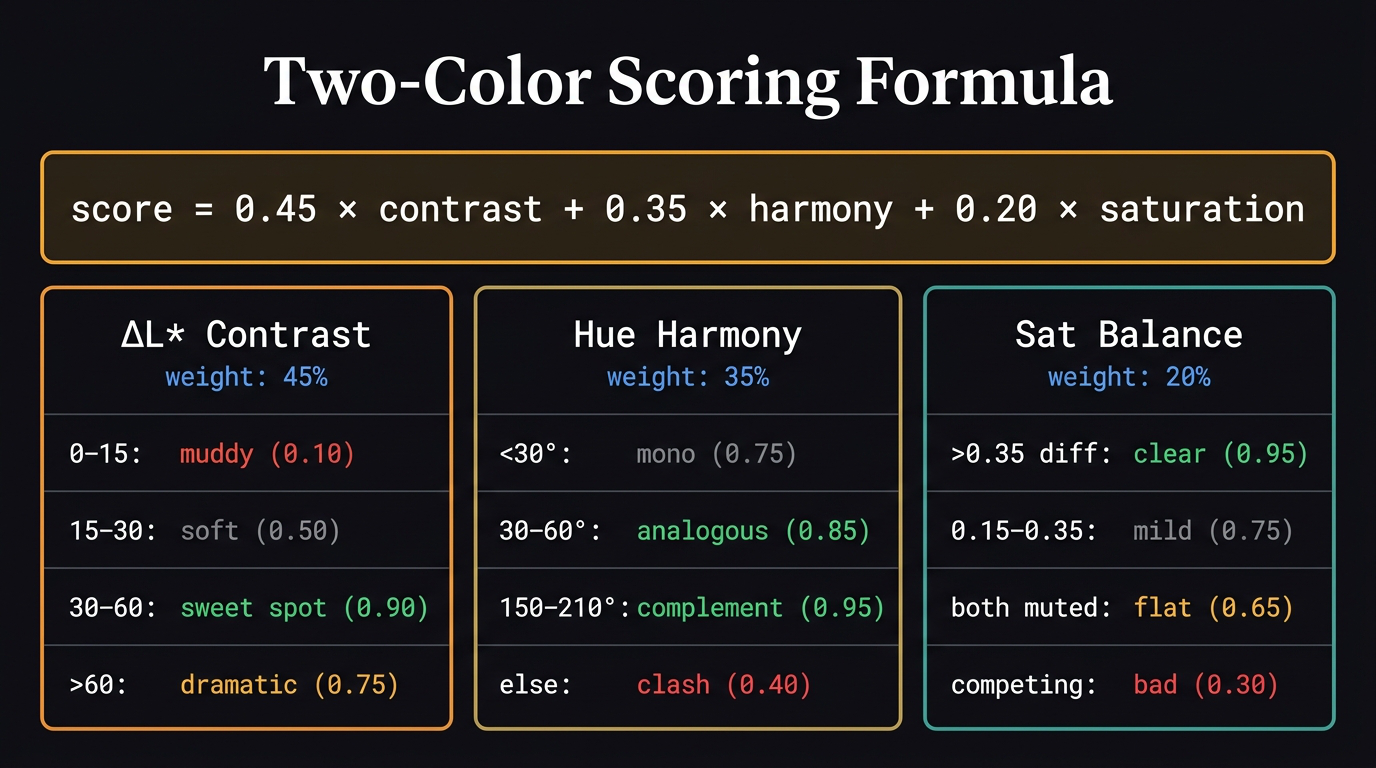
7. The two-color scoring algorithm
You have two hex colors. You want one number that says how well they match. You need to measure three independent axes and combine them. A pair can fail in three completely different ways:
- Same lightness → no hierarchy (axis 1 fails)
- Wrong hue angle → unresolved clash (axis 2 fails)
- Both saturated → competing for dominance (axis 3 fails)
Axis 1 — Lightness contrast (\(\Delta L^*\)) — weight: 45%
Extract \(L^*\) from each color. Subtract. That’s it.
| \(\Delta L^*\) | What the eye sees | Score |
|---|---|---|
| 0–15 | Muddy — no winner, eye bounces | 0.10 |
| 15–30 | Soft contrast — readable but gentle | 0.50 |
| 30–60 | Clear hierarchy — sweet spot | 0.90 |
| >60 | Dramatic — works but can feel harsh | 0.75 |
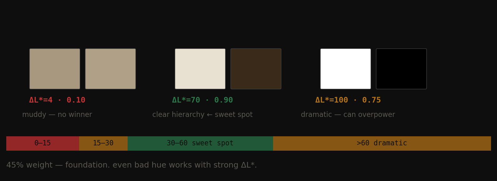
Fig 11. Left: \(\Delta L^*\)=4 — muddy, no winner. Centre: \(\Delta L^*\)=70 — clear hierarchy, sweet spot. Right: \(\Delta L^*\)=100 — dramatic, can overpower.
This gets 45% of the weight because it’s the foundation. Even terrible hue combinations work if one color is clearly darker than the other. Without \(\Delta L^*\), no pair can succeed.
Axis 2 — Hue harmony — weight: 35%
Convert each color to HSV, extract the hue angle (0°–360°), measure the shortest arc between them.
| Distance | Relationship | Score |
|---|---|---|
| One color sat < 0.12 | Neutral — always works | 0.80 |
| < 30° | Monochromatic | 0.75 |
| 30°–60° | Analogous — cohesive | 0.85 |
| 150°–210° | Complementary — maximum energy | 0.95 |
| Anything else | Unclassified — tension or clash | 0.40 |
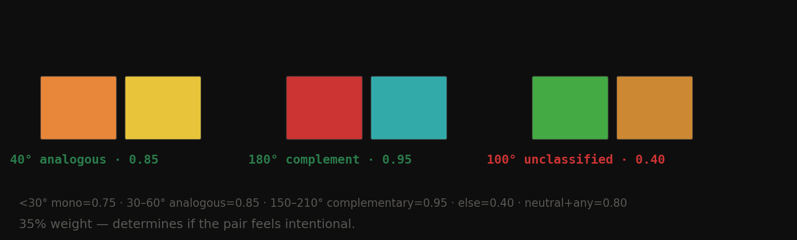
Fig 12. 40° analogous (0.85), 180° complementary (0.95), 100° unclassified (0.40). The unclassified zone is where most bad rooms live.
The neutral rule is critical: if one color has near-zero saturation, hue angle is irrelevant. Cream doesn’t have a hue fight with navy because cream has no hue to fight with.
Axis 3 — Saturation balance — weight: 20%
Measure the saturation of each color (0–1 scale). Take the absolute difference.
| Sat difference | Meaning | Score |
|---|---|---|
| > 0.35 | Clear role: one dominant, one supporting | 0.95 |
| 0.15–0.35 | Mild distinction | 0.75 |
| Both < 0.20 | Both muted — safe but flat | 0.65 |
| Both high, diff < 0.15 | Competing — neither becomes background | 0.30 |
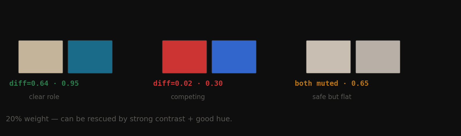
Fig 13. Clear role (diff=0.64, score=0.95) vs competing (diff=0.02, score=0.30) vs both muted (score=0.65).
This gets only 20% because a bad saturation balance can be rescued by strong contrast and good hue. Hermès proves this.
The final score
The complete scoring formula with all three axes and their score ranges.
$$\text{score} = 0.45 \times \text{contrast} + 0.35 \times \text{harmony} + 0.20 \times \text{saturation}$$
Hermès traced through the algorithm
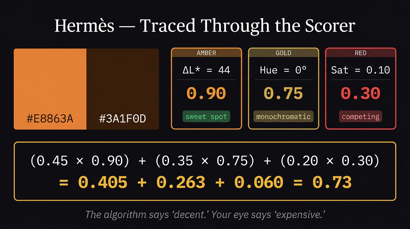
Hermès walked through the scorer step by step. The algorithm says “decent.” Your eye says “expensive.”
- \(\Delta L^*\) = 44 → contrast score = 0.90
- Hue = 0° apart (both ~25° on wheel) → monochromatic → harmony score = 0.75
- Sat diff = 0.10 → competing → sat score = 0.30
- Final = (0.45×0.90) + (0.35×0.75) + (0.20×0.30) = 0.405 + 0.263 + 0.06 = 0.73
The algorithm sees competing saturation and penalizes it. A designer sees competing saturation and calls it expensive tension. That gap is Post 05.
8. What the scorer reveals — 8 example pairs
| Pair | \(\Delta L^*\) | Hue dist | Score | Verdict |
|---|---|---|---|---|
| Hermès orange + dark brown | 43.2 | 0° | 0.73 | decent |
| Scandi warm white + navy | 56.2 | 170° | 0.88 | great |
| Muddy — same tone, same hue | 1.4 | 2° | 0.37 | poor |
| Both neutrals — flat | 8.2 | 6° | 0.45 | poor |
| Complementary red + green | 15.8 | 146° | 0.42 | poor |
| Analogous warm browns | 24.3 | 5° | 0.64 | decent |
| Monochromatic two oranges | 4.7 | 8° | 0.37 | poor |
| White + pure red | 46.8 | 0° | 0.88 | great |
The Hermès observation: scores only 0.73 — the algorithm sees same hue zone and competing saturation. It doesn’t know this is intentional tension. That’s the gap Post 05 fills — tension as a positive signal, not a flaw.
9. Color hierarchy — what the eye reads first
The eye doesn’t have a preference for light or dark. It has one rule: go to the highest contrast point relative to surroundings. The element with the greatest \(\Delta L^*\) against its background gets read first. Always.
But spatial physics matters in rooms:
- Dark colors absorb light → appear to advance toward you → feel heavier, closer, grounded
- Light colors reflect light → appear to recede → feel airier, farther, larger
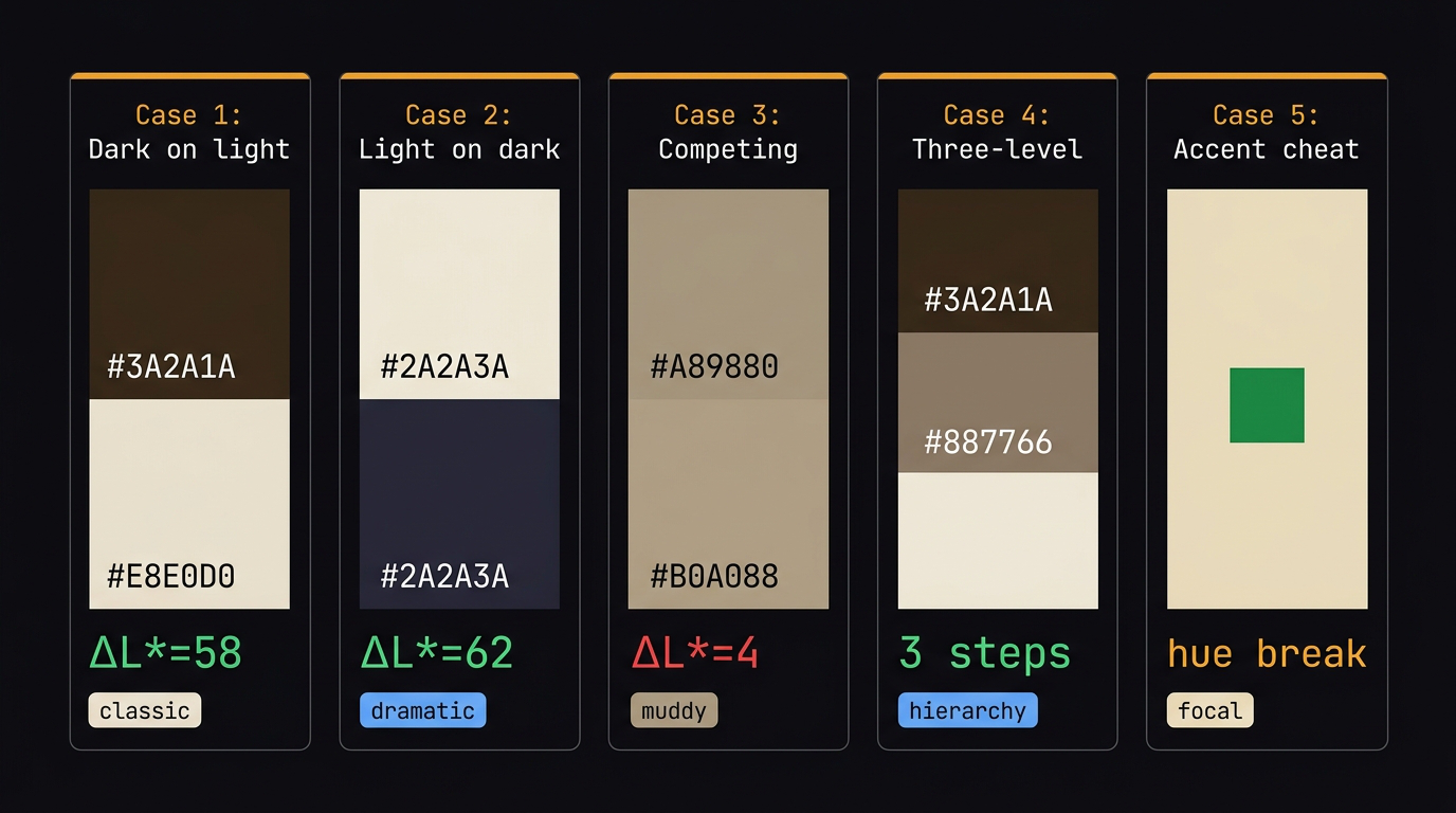
The five hierarchy cases. Only Cases 1, 2, 4, and 5 work. Case 3 (competing) always fails.
The five hierarchy cases
Case 1 — Clear hierarchy, dark on light. Dark sofa on light wall. \(\Delta L^* = 58\). Eye reads sofa first, wall recedes. Classic, effortless.
Case 2 — Reversed hierarchy, light on dark. Light sofa on dark wall. \(\Delta L^* = 62\). Still works — dramatic and enclosing. The room feels smaller and more intimate.
Case 3 — Competing colors. Same lightness sofa and wall. \(\Delta L^* = 4\). Eye bounces between them looking for a winner. Finds none. Exhausting. This is the muddy middle.
Case 4 — Three-color hierarchy. Dark sofa (\(L^* = 18\)) + mid floor (\(L^* = 52\)) + light wall (\(L^* = 89\)). Every transition \(\Delta L^* > 30\). The room has a clear reading order: sofa → floor → wall. This is the goal.
Case 5 — The accent cheat. Small area of high contrast breaks the neutral hierarchy entirely. A green pillow (\(\Delta L^* = 44\), hue break=160°) in a beige room. 5% of the area. 100% of the first glance. Designers use this deliberately to create focal points.
When do colors compete?
Three conditions — any one is enough:
- Same lightness + same saturation → neither can be background, eye oscillates
- Same hue family, different saturations → reads as a mistake, not a decision
- Both high saturation, different hues → neither recedes, room feels aggressive
The fix in all three cases: one color leads on every axis, or one color is explicitly neutral. You cannot have two winners.
10. Color and psychology — the two layers
Color psychology has two distinct layers that most people confuse.
Layer 1 — Hardwired (universal across cultures)
Built into primate biology. Consistent globally.
| Signal | Effect | Why |
|---|---|---|
| High lightness | Safe, open, spacious | Bright = open savanna, no predators |
| Low lightness | Enclosed, intimate | Darkness = threat, survival alert |
| Warm hues (red, orange) | Mild stress arousal, appetite, alertness | Blood, fire — attention signals |
| Cool hues (blue, green) | Calm, lower heart rate, time feels faster | Water, sky, safety |
Layer 2 — Cultural (learned, varies by region)
- White = mourning (Asia) vs celebration (West)
- Red = danger (universal biology) vs luck (China) vs revolution (Soviet)
- Green = envy (English) vs fertility (Middle East)
Your scoring system encodes whichever associations are in its training data. A model trained on Western living rooms learns Western emotional associations. Know this limitation.
Two-color emergent psychology
Combinations produce emotional effects not predictable from individual colors alone.
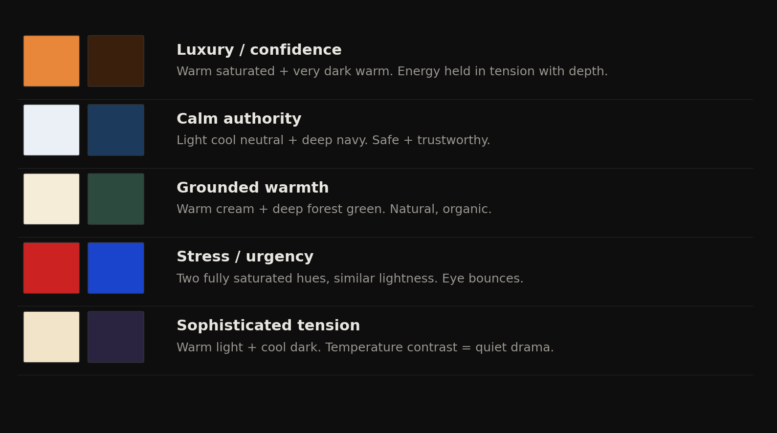
Fig 14. Five archetypal two-color emotional effects — none of these are predictable from either color alone.
| Pair | Emotional effect | Why |
|---|---|---|
| Warm saturated + very dark warm | Luxury, confidence | Energy held in tension with depth |
| Light cool neutral + deep navy | Calm authority | Safe + trustworthy, no biological threat signal |
| Warm cream + deep forest green | Grounded warmth | Most-liked living room combo globally — natural, organic |
| Two fully saturated hues, similar lightness | Stress, urgency | Eye bounces, heart rate rises |
| Warm light + cool dark | Sophisticated tension | Temperature contrast = quiet drama |
The last one is the most interesting: warm light + cool dark is not predictable from either color alone. Warm cream is unremarkable. Deep indigo is cold. Together they create what designers call “quiet drama” — the same asymmetry principle as Hermès but across temperature instead of saturation.
The cultural caveat: If you score 5000 living room images scraped from Pinterest (mostly Western, mostly affluent), your scorer will learn that cream + navy = high quality. Show it a Moroccan riad interior with saturated terracotta + deep cobalt and it will score it poorly — not because it’s wrong, but because it’s outside the training distribution. Always know what your data is encoding.
11. 10 famous brands — scored
Running 10 global brands through the two-color scorer. Sorted by score.
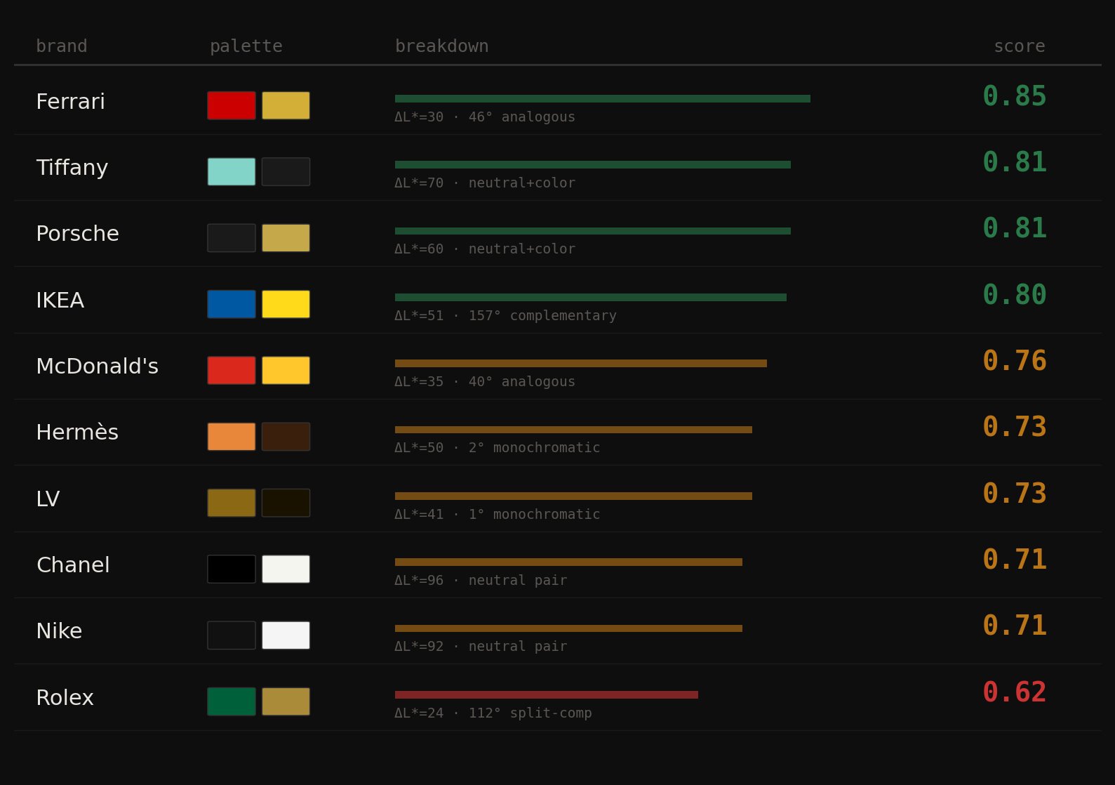
Fig 15. Brand palette scores from Ferrari (0.85) down to Rolex (0.62). The luxury cluster at 0.71–0.73 is not random.
| Brand | Color 1 | Color 2 | \(\Delta L^*\) | Hue dist | Harmony type | Score |
|---|---|---|---|---|---|---|
| Ferrari | #CC0000 |
#D4AF37 |
30.3 | 46° | analogous | 0.85 |
| Tiffany | #82D4C8 |
#1A1A1A |
70.4 | 171° | neutral+color | 0.81 |
| Porsche | #1A1A1A |
#C4A84A |
60.4 | 46° | neutral+color | 0.81 |
| IKEA | #0058A3 |
#FFDA1A |
50.6 | 157° | complementary | 0.80 |
| McDonald’s | #DA291C |
#FFC72C |
35.3 | 40° | analogous | 0.76 |
| Hermès | #E8863A |
#3A1F0D |
50.4 | 2° | monochromatic | 0.73 |
| LV | #8B6914 |
#1A1200 |
40.6 | 1° | monochromatic | 0.73 |
| Chanel | #000000 |
#F5F5F0 |
96.4 | — | neutral pair | 0.71 |
| Nike | #111111 |
#F5F5F5 |
91.5 | — | neutral pair | 0.71 |
| Rolex | #006039 |
#AA8B3A |
23.9 | 112° | split-comp | 0.62 |
Ferrari scores highest (0.85) — and it’s not obvious why. Red and gold are both warm, both saturated — they should fight. But \(\Delta L^*\)=30 lands exactly in the sweet spot, the 46° analogous angle is cohesive, and saturation difference of 0.26 gives gold a clear supporting role. The algorithm and the eye agree on this one.
Chanel and Nike score identically (0.71) — for completely different reasons. Both score lower than expected because \(\Delta L^*\)>60 gets penalized as “too dramatic.” What the scorer misses: these brands have transcended color. Black + white is a concept, not a palette. Scoring it like a living room is the wrong frame entirely.
Rolex scores lowest (0.62) — the most interesting scorer failure. \(\Delta L^*\)=24 is soft contrast, 112° is an awkward split-complementary angle. By every technical rule, green + gold shouldn’t work. But Rolex has used this pairing for 70 years and it reads as the most expensive combination on the list. \(\Delta L^*\) doesn’t capture cultural association. Green + gold = forest + treasure. The association is so deep the technical weakness disappears.
The pattern that shouldn’t exist but does: luxury brands cluster at 0.71–0.73, mass market at 0.76–0.85. Luxury brands deliberately choose pairings that create tension or transcend the scoring axes. They don’t want “harmonious.” They want “unmistakable.” Mass market brands optimize for immediate legibility — high contrast, clear harmony, unambiguous roles.
The scorer measures color harmony. Brands use color as identity. Those are different problems. A living room palette should score 0.80+. A brand identity can afford to score 0.62 if the tension is deliberate and consistently applied over decades. The Rolex combination only works because every Rolex ad, box, and dial has used it since 1953. The cultural weight overrides the technical weakness. That gap is Post 05.
12. The luxury cluster — why it exists
Luxury brands score 0.62–0.73. Mass market scores 0.76–0.85. This is not random. Four formulas emerge from analyzing 15 luxury brands in Lab space:
Formula 1 — Dark neutral + warm gold.
Color 1: \(L^*\)<15, saturation ≈ 0 (near black). Color 2: \(L^*\)=65–75, \(b^*\)>15 (warm gold/amber). Maximum authority. Black = weight, silence. Gold = warmth, value.
Brands: Rolls Royce, Porsche, Lamborghini
Formula 2 — Dark warm anchor + gold/tan.
Both colors in the same warm hue family (monochromatic, <10° apart). Huge \(\Delta L^*\) gap (35–55). No cool tones anywhere — tension is entirely in lightness.
Brands: Hermès, LV, Cartier, Bottega
Formula 3 — Pure neutral pair.
Both colors near-zero saturation, extreme \(\Delta L^*\). The palette IS the concept — absence of color signals transcendence above color. Only works with decades of brand equity.
Brands: Chanel, Nike, Apple
Formula 4 — Dark cool anchor + warm gold.
Deep green or navy (\(L^*\)=15–35) + warm gold (\(L^*\)=65–75). Temperature contrast: nature + treasure, forest + wealth. Cultural meaning overrides technical weakness.
Brands: Rolex, Gucci, Bentley
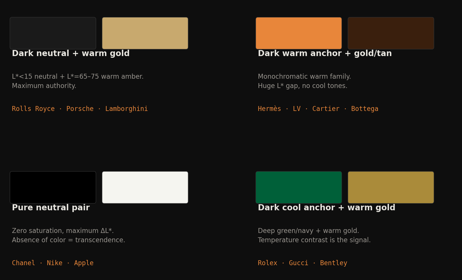
Fig 16. Four luxury color formulas visualized. All four avoid complementary angles. Tension comes from the \(L^*\) axis, not the hue axis.
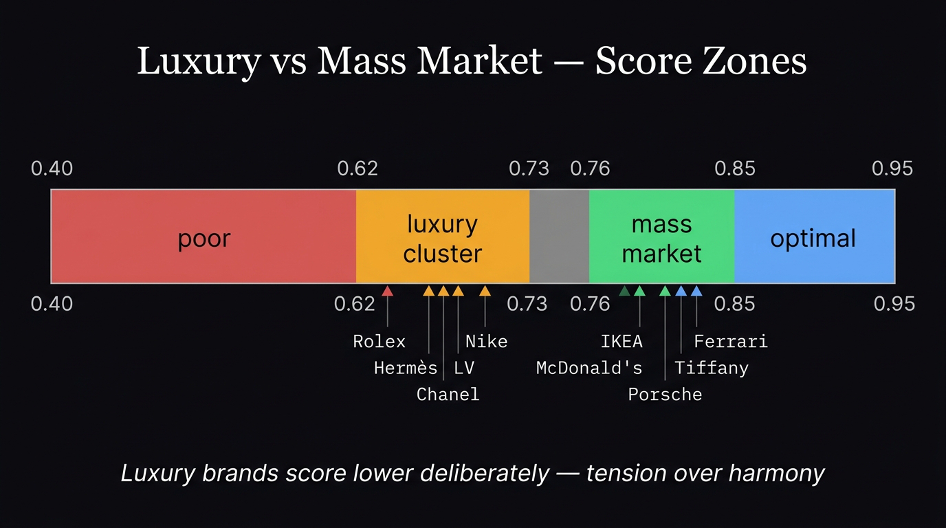
Luxury vs mass market score zones. Luxury brands deliberately score lower — tension over harmony.
The luxury Lab fingerprint
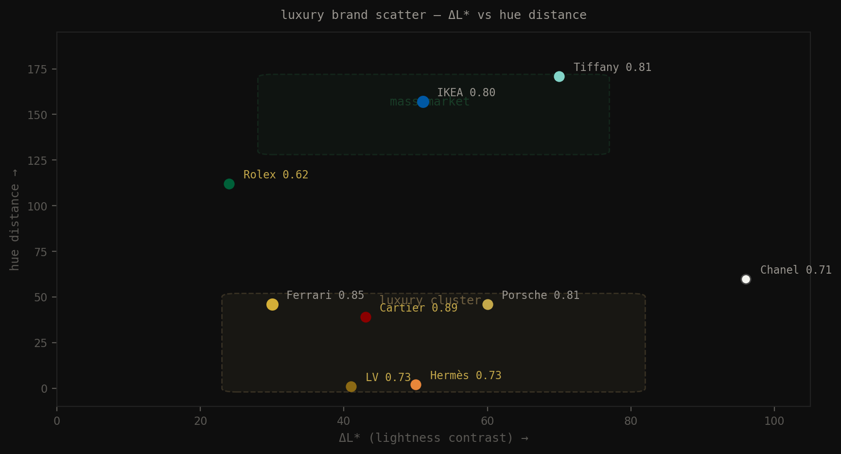
Fig 17. \(\Delta L^*\) vs hue distance: luxury cluster occupies the monochromatic zone (low hue distance) with moderate-to-high contrast. Mass market clusters toward complementary angles.
The luxury cluster occupies the monochromatic zone (low hue distance, <30°) with moderate-to-high \(\Delta L^*\) (35–65). They use the same hue family with extreme lightness variation. Tension is in the \(L^*\) axis, not the hue axis.
| Property | Luxury anchor color | Luxury secondary |
|---|---|---|
| \(L^*\) | 10–30 | 60–80 |
| \(a^*\) | 2–10 | 2–8 |
| \(b^*\) | 5–18 | 10–30 |
| Saturation | 0–0.85 | 0.35–0.75 |
| Temperature | warm or neutral | warm |
Both colors tend warm (positive \(b^*\)). Never blue as the dominant. Never pure vivid primaries. The combination reads as: weight + warmth + restraint.
The luxury formula in Lab space: one dark anchor (\(L^*\)<30), one warm secondary (\(L^*\)=60–75, \(b^*\)>10), both in the same warm hue family, \(\Delta L^*\)=35–55. The scorer sees “monochromatic with competing saturation” and gives it 0.73. Your eye sees it as expensive. That gap is the entire argument of Post 05.
13. Code appendix
Two-color pair scorer
def score_pair(hex1, hex2):
    rgb1, rgb2 = hex_to_rgb(hex1), hex_to_rgb(hex2)
    lab1, lab2 = rgb_to_lab(rgb1), rgb_to_lab(rgb2)
    hsv1, hsv2 = rgb_to_hsv(rgb1), rgb_to_hsv(rgb2)

    # 1. Lightness contrast
    delta_L = abs(lab1[0] - lab2[0])
    if delta_L < 15:   contrast_score = 0.1   # muddy
    elif delta_L < 30: contrast_score = 0.5   # soft
    elif delta_L < 60: contrast_score = 0.9   # clear hierarchy
    else:              contrast_score = 0.75  # dramatic

    # 2. Hue harmony
    ang_dist = angular_distance(hue1, hue2)
    if both_neutral:             harmony_score = 0.70
    elif one_neutral:            harmony_score = 0.80
    elif ang_dist < 30:          harmony_score = 0.75  # monochromatic
    elif ang_dist < 60:          harmony_score = 0.85  # analogous
    elif 150 <= ang_dist <= 210: harmony_score = 0.95  # complementary
    else:                        harmony_score = 0.40  # tension/clash

    # 3. Saturation balance
    sat_diff = abs(s1 - s2)
    if sat_diff > 0.35:   sat_score = 0.95  # clear role
    elif sat_diff > 0.15: sat_score = 0.75  # mild distinction
    else:                 sat_score = 0.30  # competing

    return 0.45 * contrast_score + 0.35 * harmony_score + 0.20 * sat_score
Batch scoring 5000 images
def score_image(image_path):
    hex1, hex2, cov1, cov2 = extract_top2_palette(image_path)
    result = score_pair(hex1, hex2, verbose=False)
    result["coverage_1"] = cov1
    result["coverage_2"] = cov2
    return result

# ~4 img/sec on CPU → 5000 images ≈ 20 min
# output: one row per image with final_score, harmony_type, delta_L, hue_distance
dataHacker.rs — LLM_log #016: Color in Living Rooms 101 — Post 01 of 7
Vladimir Matic | datahacker.rs
Next: Post 02 — The 60-30-10 rule. Why equal coverage always looks chaotic.